How to Choose Wall Art That Matches Modern Furniture
The Heva Team
Art Curators & Interior Design Enthusiasts · February 1, 2026 · 16 min read
Stop guessing. Learn exactly how to choose wall art that complements your furniture for a designer-quality room.
You finally found the perfect sofa, chose a coffee table that makes you smile, and arranged every cushion just so. But the wall behind it all still feels empty, and no matter how many times you browse online, nothing quite clicks. That disconnect between furniture you love and art that completes the room is one of the most common frustrations in home decorating. This guide breaks down exactly how to choose wall art that works with your furniture, covering colour coordination, style matching, scale rules, and real product recommendations so you can stop guessing and start decorating with confidence.
Ready to browse? Explore our full canvas art collection, or keep reading for our top picks and expert tips.
What You Will Find in This Guide
- Colour Wheel Coordination: Matching Art to Your Furniture Palette
- Style Matching Guide: Art for Every Furniture Aesthetic
- Scale and Proportion Rules: Getting the Size Right
- Our Top 6 Picks for Furniture-Matched Wall Art
- Room-by-Room Styling Examples
- 5 Common Mistakes When Matching Art to Furniture
- Frequently Asked Questions
- Quick Reference Table
Colour Wheel Coordination: Matching Art to Your Furniture Palette
Colour is the single fastest way to connect wall art to the furniture beneath it. The approach is simpler than most people think: you do not need to match exactly, you need to create a conversation between tones. Interior designers use three core colour strategies, each backed by decades of colour theory and practical room styling.
The Complementary Method
Pick the dominant colour of your sofa or sideboard, then find art featuring the colour directly opposite it on the colour wheel. A navy sofa, for example, pairs beautifully with art that carries warm amber, burnt sienna, or terracotta tones. The contrast creates energy without clashing. Research from the Furnishr design team confirms that complementary pairings draw the eye and give a room instant character, even when the furniture itself is understated.
The Analogous Method
If you prefer calm, tonal interiors, choose art that sits within two or three neighbours of your furniture colour on the wheel. A sage green armchair beside a canvas carrying olive, teal, and forest tones creates a layered look that feels intentional without being matchy. This approach works especially well in bedrooms and reading nooks where you want the eye to rest rather than bounce.
The Accent Pull
Look at your throw pillows, rug, or lamp shade. Pull one accent colour from those accessories and let it dominate the artwork. This ties smaller decor details to the wall, creating a through-line that professional stagers call "colour threading." For a room with a grey sofa and mustard cushions, a landscape painting with golden hour tones will anchor the entire scheme. If you want a deeper dive into how colour affects mood and buying decisions, read our Psychology of Colours in Wall Art guide.
Style Matching Guide: Art for Every Furniture Aesthetic
Furniture and art both carry a visual vocabulary. A sleek walnut credenza speaks a completely different language from a whitewashed farmhouse console. Matching that language, or intentionally mixing it, is what separates rooms that feel curated from rooms that feel random. According to the design experts at Furnishr, the secret is to match the "weight" of the art to the weight of the furniture, meaning visual density, line quality, and finish.
Modern and Contemporary Furniture
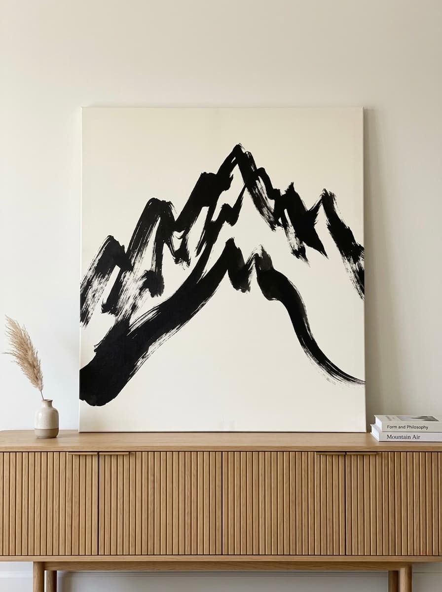
Clean lines, metal or glass accents, and neutral upholstery call for art with bold simplicity. Abstract canvases, minimalist compositions, and monochromatic photography all work. Avoid ornate gilded frames; a slim black or natural wood float frame keeps the modern language consistent. Wall art with visible brushwork or textural impasto adds warmth without compromising the clean aesthetic.
Mid-Century Modern
Tapered legs, organic curves, and warm wood grains define this style. Geometric patterns, colour-block abstracts, and designs inspired by 1950s and 1960s graphic art complement the era. Colour palettes in mustard, teal, olive, and burnt orange echo the period perfectly. Symmetrical placement above a credenza (centred, with 15 to 20 cm or 6 to 8 inches of breathing room on each side) completes the look.
Farmhouse and Rustic
Reclaimed wood, distressed finishes, and linen upholstery pair with art that carries organic, textural qualities. Landscapes, botanical prints, animal portraits (especially livestock or woodland creatures), and muted still lifes all reinforce the farmhouse narrative. Frame choices matter here: a natural oak or weathered grey frame feels right, while a glossy black frame fights the style.
Boho and Eclectic
Rattan, macrame, layered textiles, and mixed-era furniture welcome art that is equally layered and expressive. Wildflower scenes, cultural motifs, abstract florals, and vibrant colour palettes thrive in boho spaces. The key rule is intentional variety: mix frame sizes and hang at slightly different heights to create a collected-over-time gallery feel. Our Gallery Wall Guide walks through exactly how to arrange an eclectic grouping.
Minimalist
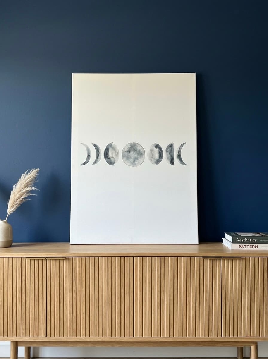
Less furniture means every piece must earn its place, and the same goes for art. One large-scale canvas above a low-profile platform bed or a single statement piece above a floating shelf makes a stronger impact than a cluster of small frames. Monochrome tones, soft gradients, and subjects with negative space (ocean horizons, single botanical stems, solitary animals) pair with minimalist furniture without adding visual noise.
Traditional and Classical
Carved wood details, tufted upholstery, and rich fabrics like velvet or brocade call for art with equal gravitas. Oil-style portraits, Dutch Golden Age still lifes, and classical mythology scenes match the formality. Gilded or ornate frames reinforce the look. Hang art at gallery height, with the centre of the canvas at approximately 145 cm (57 inches) from the floor, which aligns with museum standards worldwide.
Scale and Proportion Rules: Getting the Size Right
Even the most beautiful painting will look wrong if the size does not relate to the furniture below it. Three rules will keep you safe every time.
The Two-Thirds Rule
Your artwork (or art grouping) should span roughly two-thirds the width of the furniture it hangs above. For a 180 cm (72 inch) sofa, that means approximately 120 cm (48 inches) of art width. Going wider makes the furniture feel small; going too narrow leaves awkward dead space on either side. For guidance on exact sizing for your living room, see our Wall Art Size Guide.
The 15 to 20 cm Gap
Leave 15 to 20 cm (6 to 8 inches) between the top of the furniture and the bottom of the frame. This spacing creates visual connection without the art looking like it is sitting directly on the sofa back. Above a console table with a lamp, you may need to increase this to 25 cm (10 inches) so the frame does not compete with the lamp height.
The Ceiling Factor
In rooms with standard 240 cm (8 foot) ceilings, a canvas between 60 cm and 90 cm (24 to 36 inches) tall works over most furniture. For rooms with higher ceilings (300 cm or 10 feet and above), scale up to 100 cm or 120 cm (40 to 48 inches) tall. The art should fill approximately 60 to 75 percent of the available wall space between the furniture top and the ceiling.
Our Top 6 Picks for Furniture-Matched Wall Art
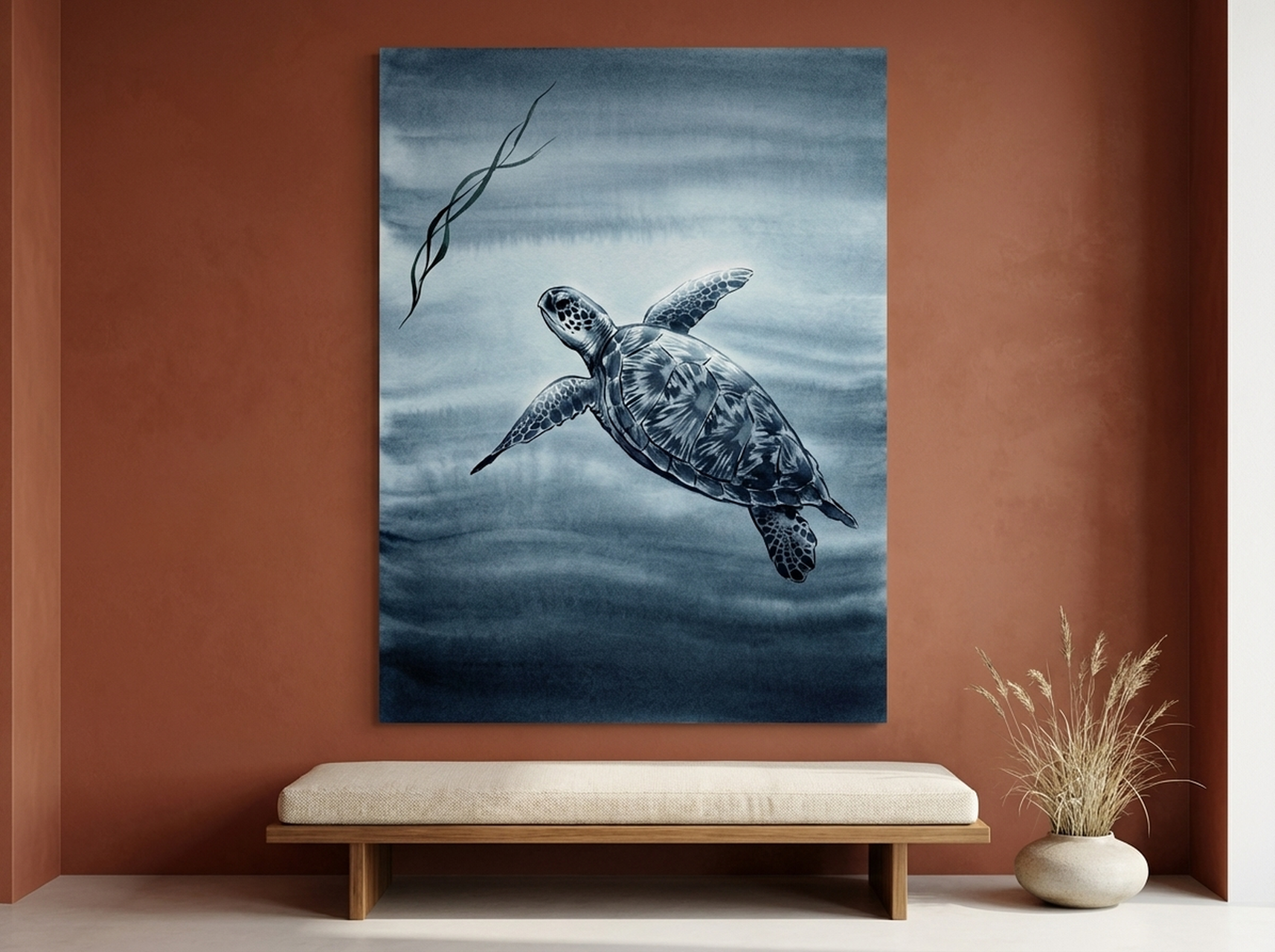
1. Sea Turtle Canvas Wall Art: Minimalist Modern Pairing
This minimalist sea turtle painting pairs navy, teal, and charcoal tones with generous negative space, making it a natural companion for contemporary furniture with clean lines. Hang it above a low-profile grey sofa or a white floating console for a calm, coastal-modern effect. The subdued palette means it works with cool-toned metals like brushed nickel or chrome hardware. The single-subject composition keeps a minimalist room from feeling cluttered while adding organic softness to hard-edged furniture.
2. Wildflower Meadow Canvas Wall Art: Boho Eclectic Pairing
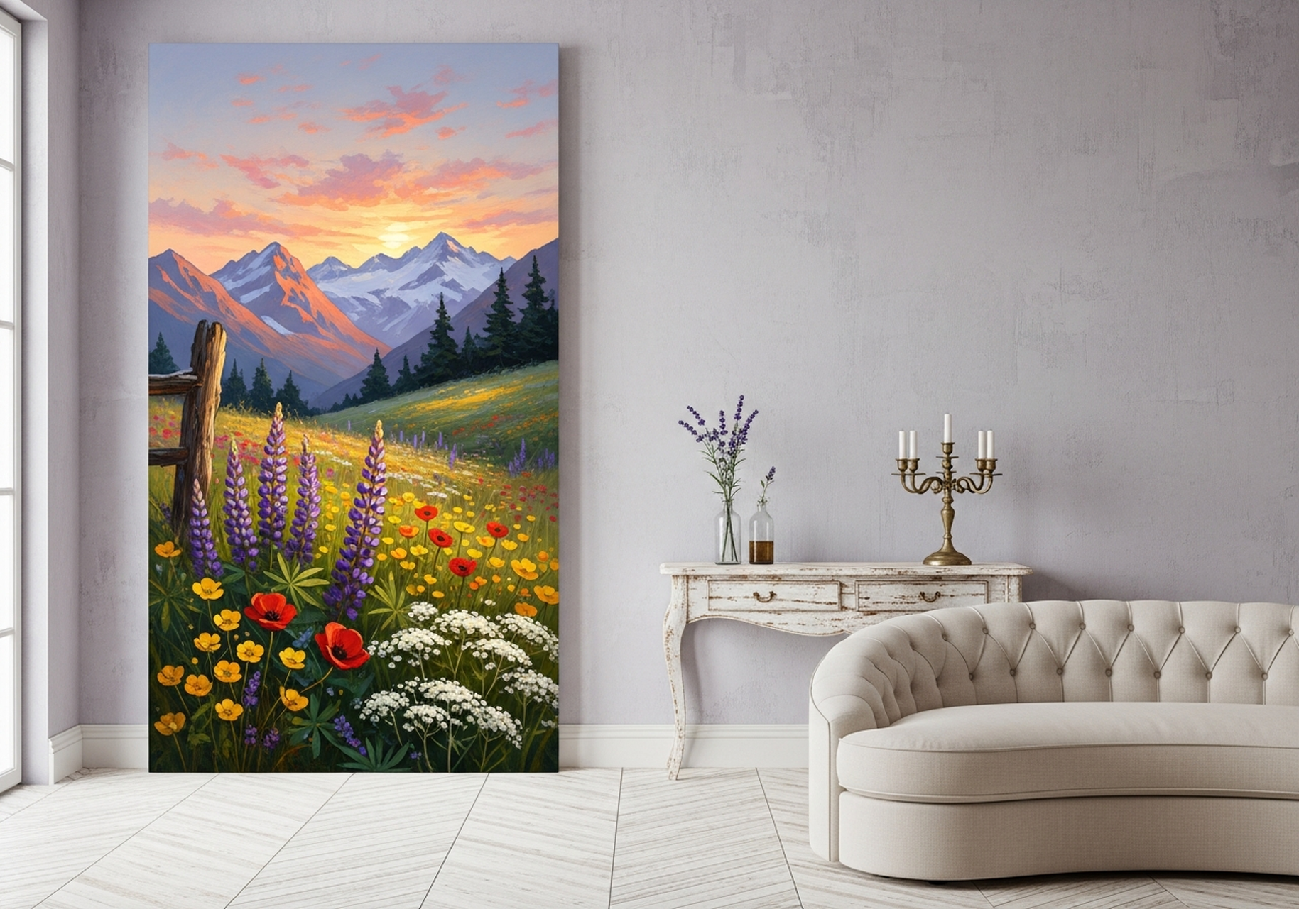
Bursting with lavender, purple, red, and golden sunset hues, this wildflower meadow landscape is the perfect anchor above a rattan headboard or a woven jute bench. The loose, painterly brushwork echoes the textural layering that defines boho interiors. Pair it with mismatched vintage nightstands and a linen duvet for that collected-over-time feel. The mountain backdrop adds depth and a sense of place, which keeps the eclectic mix from feeling aimless.
View the Wildflower Meadow Canvas
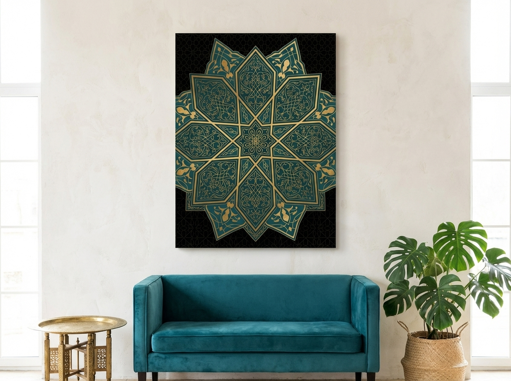
3. Islamic Geometric Star Canvas Wall Art: Mid-Century and Global Pairing
Geometric precision meets rich colour in this arabesque-inspired canvas featuring interlocking teal and gold star patterns. The mathematical symmetry pairs beautifully with the clean, angular lines of mid-century walnut credenzas and tapered-leg sideboards. Teal and gold were signature mid-century accent colours, so this piece feels era-appropriate without being a reproduction. It also works in global-eclectic interiors above a Moroccan-style console or a modern marble entry table. The pattern density gives it visual weight, so a single large canvas makes more impact than a grouping.
View the Islamic Geometric Star Canvas
4. Northern Lights Canvas Wall Art: Contemporary Statement Pairing
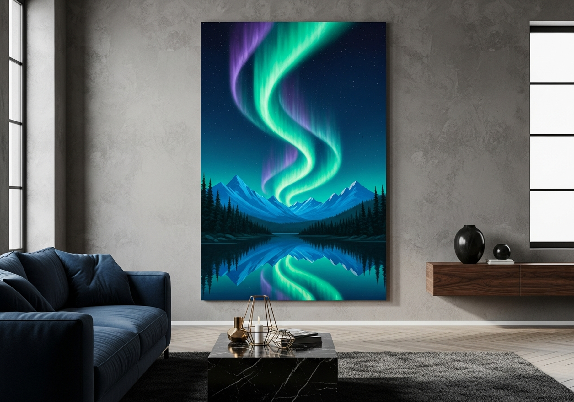
Deep navy, electric turquoise, and glowing green ripple across this aurora borealis landscape, making it a showstopper above a dark upholstered bed frame or a charcoal sectional sofa. The dramatic colour range means it serves as the room's colour source: pull a turquoise throw pillow and a deep navy rug from the painting, and the entire space will feel designed by a professional. This canvas works best when the surrounding furniture stays neutral (black, charcoal, white, or warm grey) so the aurora colours can dominate without competition.
View the Northern Lights Canvas
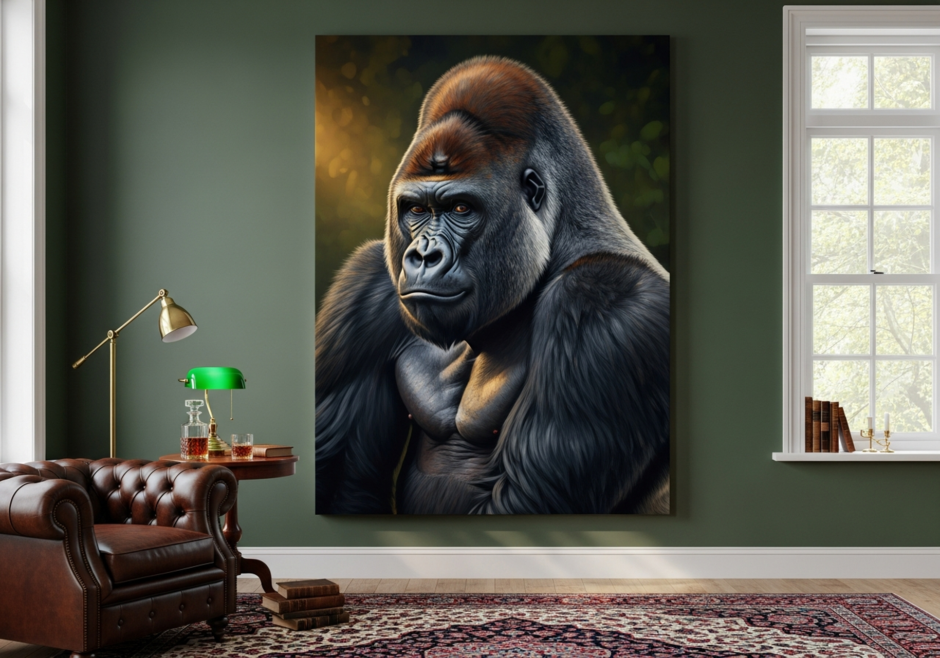
5. Silverback Gorilla Canvas Wall Art: Bold Library and Den Pairing
Commanding presence and rich, dark tones make this silverback gorilla portrait an ideal companion for heavy, traditional furniture: think tufted leather Chesterfield sofas, dark walnut bookshelves, and brass reading lamps. The black, charcoal, and gold palette echoes the deep finishes typical of library and den spaces. Wildlife portraiture carries the same visual gravitas as classical human portraiture, so this canvas holds its own beside ornate furniture without feeling casual. Position it at eye level above a fireplace mantel or centred above a leather sofa for maximum impact.
View the Silverback Gorilla Canvas
6. Lemon Branch Canvas Wall Art: Farmhouse Kitchen Pairing
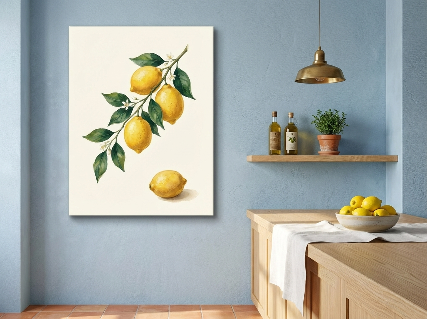
Bright lemon yellow against a clean cream background gives this botanical canvas the fresh, cheerful energy that farmhouse kitchens and dining rooms thrive on. Hang it above a white shiplap wainscot, beside open pine shelving, or centred over a distressed oak dining table. The Mediterranean-inspired subject pairs naturally with rustic earthenware, woven placemats, and fresh herbs on the windowsill. The simple composition means it works in narrow wall spaces between cabinets or as a pair flanking a kitchen window, each piece 40 cm (16 inches) wide, with 10 cm (4 inches) between them.
Room-by-Room Styling Examples
Living Room
The sofa wall is the main event. Use the two-thirds rule to size your art relative to the sofa width. For a dark leather couch, choose art with warm metallics (gold, amber, bronze) to echo the richness. For a light linen sofa, cool-toned landscapes or soft abstracts keep the airy feeling intact. If you have a sectional that wraps a corner, consider a gallery wall arrangement of three to five pieces that follows the L-shape, anchoring the longer side with the largest canvas.
Bedroom
Above the headboard is prime real estate. A single wide canvas (120 to 150 cm or 48 to 60 inches) creates a calm focal point. Match the art's mood to how you want to feel when you wake up: soft landscapes and muted botanicals for tranquillity, vibrant abstracts for creative energy. Avoid hanging art with glass directly above where you sleep; canvas prints eliminate that concern entirely. Leave 15 cm (6 inches) between the top of the headboard and the bottom edge of the canvas.
Dining Room
Art in the dining room should complement the table material. A dark mahogany table pairs with classical still lifes or rich portraiture in warm frames. A modern glass or white lacquer table works with bold, colour-saturated canvases. Hang the art so the centre sits at seated eye level, roughly 120 cm (48 inches) from the floor, rather than standing eye level. This is one of the most overlooked rules in dining room design.
Home Office
Your desk is the anchor furniture. Art behind your desk (visible on video calls) should be intentional and professional. Nature scenes, abstract art, and motivational typography all work. Avoid hanging art directly in front of where you sit; peripheral art reduces distraction. Instead, place your statement piece on the wall behind your monitor or to the side at a 45 degree angle from your seated position.
5 Common Mistakes When Matching Art to Furniture
1. Matching Too Exactly
Buying art that matches your sofa fabric swatch-for-swatch creates a showroom effect that feels sterile rather than lived-in. Instead of matching the dominant colour, pull a secondary or accent colour from your furniture fabric. A grey sofa with a single thread of rust in the weave? Let that rust become the star of your artwork.
2. Hanging Too High
This is the most common mistake of all. Art that floats 30 cm (12 inches) or more above the sofa disconnects from the furniture and creates an awkward gap. The centre of your canvas should sit at 145 cm (57 inches) from the floor when the art is standalone, or 15 to 20 cm (6 to 8 inches) above the furniture when hung in relation to a piece below it.
3. Going Too Small
A tiny 30 cm by 30 cm (12 by 12 inch) canvas above a 200 cm (80 inch) sofa looks like an afterthought. If budget limits the size, group multiple smaller pieces to create a visual mass that fills two-thirds of the furniture width. Three 40 cm (16 inch) canvases with 5 cm (2 inch) gaps between them create a 130 cm (52 inch) spread that holds its own above a large sofa.
4. Ignoring Frame Style
A baroque gilded frame on a minimalist floating shelf fights itself. Match frame profiles to furniture style: slim and black for modern, natural wood for Scandinavian or farmhouse, ornate for traditional. When in doubt, a simple float frame in black or natural oak works with almost every furniture style.
5. Forgetting Lighting
Art that looks perfect in the shop can disappear in a dim corner. Position your art where it receives natural or directed light. A picture light, a ceiling-mounted spotlight, or even a well-placed floor lamp angled upward can make a 50 dollar canvas look like a gallery investment. Warm white bulbs (2700K to 3000K) bring out gold and earth tones; cool white (4000K) enhances blues and greens.
Frequently Asked Questions
Does wall art have to match my furniture exactly?
No. In fact, an exact match often makes a room feel flat and overly coordinated. The goal is harmony, not uniformity. Choose art that shares one or two colours with your furniture or accessories, then let the artwork bring its own personality. Contrast in texture (smooth furniture, textured canvas) or temperature (cool furniture, warm art) creates visual interest.
What size wall art should I hang above a sofa?
Aim for art or a grouping that spans approximately two-thirds the width of the sofa. For a standard 200 cm (80 inch) sofa, that means roughly 130 cm (52 inches) of art width. The bottom edge of the frame should sit 15 to 20 cm (6 to 8 inches) above the sofa back.
Can I mix different art styles in one room?
Yes, with intention. The unifying element should be colour palette or frame style, not necessarily art style. A black and white photograph beside a colourful abstract will clash, but an abstract and a landscape that share a muted earth-tone palette can look curated and intentional. Limit yourself to two or three art styles per room to avoid visual chaos.
What wall art works with a leather sofa?
Leather sofas have strong visual weight, so they need art with equal presence. Large-scale wildlife portraits, bold abstracts with metallic tones, and rich landscape paintings all hold their own beside leather. Avoid delicate watercolours or tiny prints, which will feel overwhelmed. For brown leather, choose art with warm golds, deep greens, or navy. For black leather, high-contrast art with white, silver, or bright colour pops creates balance.
How do I choose art for a room with mixed furniture styles?
Find the common thread. Even eclectic rooms have a unifying element, usually colour. If your mid-century chair is walnut and your modern sofa is grey, a canvas that combines warm brown tones with cool grey gives both pieces a visual anchor. Abstract art is the safest choice for mixed-style rooms because it carries no period-specific associations.
Should I match wall art to my curtains or my furniture?
Furniture first, always. Curtains are easier and cheaper to replace, so they should follow the art and furniture relationship, not lead it. Choose art that relates to your largest furniture piece (usually the sofa or bed), then coordinate curtains as the final layer. If your curtains have a pattern, pick one colour from that pattern and echo it in the art, but keep the furniture as the primary reference.
Quick Reference Table
| Product | Best For | Dominant Colours | Link |
|---|---|---|---|
| Sea Turtle Canvas | Minimalist and modern furniture | Navy, teal, charcoal | View |
| Wildflower Meadow Canvas | Boho and eclectic spaces | Purple, lavender, gold | View |
| Islamic Geometric Star Canvas | Mid-century modern and global | Teal, gold, navy | View |
| Northern Lights Canvas | Contemporary and dramatic rooms | Navy, turquoise, green | View |
| Silverback Gorilla Canvas | Traditional libraries and dens | Black, charcoal, gold | View |
| Lemon Branch Canvas | Farmhouse kitchens and dining rooms | Yellow, green, cream | View |
Find the Perfect Match
Choosing wall art that matches your furniture does not require a design degree or a decorator's budget. Start with colour (pull one tone from your furniture or accessories), check the style language (modern furniture wants modern art, rustic furniture wants organic art), and measure twice before you hang (two-thirds the furniture width, 15 to 20 cm above). Every canvas in our collection is printed on museum-quality matte stock with a solid wood frame, ready to hang the day it arrives.
Browse our full wall art collection to find the piece that pulls your room together.