How to Create a Modern Gallery Wall: Step-by-Step
The Heva Team
Art Curators & Interior Design Enthusiasts · February 17, 2026 · 13 min read
Learn how to plan, arrange, and hang a gallery wall with this step-by-step guide. Includes layout templates, spacing rules, and styling tips.
A gallery wall is one of the most powerful design moves you can make in any room. It transforms a plain stretch of wall into a curated visual narrative, a personal museum that tells the story of your taste, your travels, and your values. Whether you are working with a narrow hallway or a sweeping living room wall, the principles are the same: plan carefully, space consistently, and choose art that speaks to you.
This guide walks you through every step, from measuring your wall to driving the final nail. Along the way, we share professional spacing formulas, layout templates, and common mistakes to avoid so your gallery wall looks intentional from the very first piece.
Ready to browse? Shop our gallery wall collection or keep reading for expert tips and our top picks.
1. Planning Your Gallery Wall
Every successful gallery wall starts long before you pick up a hammer. The planning phase determines whether the finished arrangement looks like it belongs in a design magazine or a dorm room. Give this step the time it deserves and the rest falls into place.
Measure your wall. Use a tape measure to record the total width and height of the wall section you want to fill. Write these numbers down. Your gallery arrangement should cover roughly two-thirds of the available wall width and sit at a comfortable viewing height. According to Art Mine, the two-thirds rule is the foundational proportion that professional designers use to determine how much wall space a gallery grouping should occupy.
Choose your wall wisely. The best walls for gallery arrangements are those you see regularly: the wall opposite a sofa, the wall at the end of a hallway, or the wall behind a dining table. Avoid walls that receive direct afternoon sunlight for extended periods, as UV exposure can fade prints over time. Walls with large windows, doors, or built-in shelving break up the visual flow and make it harder to create a cohesive arrangement.
Photograph the empty wall. Take a straight-on photo from the primary viewing distance. You can print this photo and sketch frame placements on it, or use a design app to digitally overlay rectangles where each piece will hang. This preview step catches proportion issues before you commit to nail holes.
If you are working with the wall above a sofa, the gallery should be no wider than the sofa itself. If you are filling a stairway wall, the arrangement should follow the diagonal line of the stairs, rising gradually from the bottom landing to the top. Measure twice, plan once, and you will not need to patch unnecessary holes.
2. Spacing Rules Every Designer Follows
Consistent spacing is the single biggest difference between a professional gallery wall and an amateur one. Uneven gaps between frames are immediately noticeable and make the entire arrangement look careless, no matter how beautiful the individual pieces are.
The golden range: 5 to 8 cm (2 to 3 inches). For most residential gallery walls, the ideal gap between frames falls between 5 and 8 cm. This distance is close enough to visually link the pieces into a single composition but far enough to let each work breathe on its own. Smaller gaps (under 5 cm) can feel cramped. Larger gaps (over 10 cm) start to dissolve the sense of connection between pieces.
Adjust for scale. If your pieces are large (60 cm / 24 inches or wider), you can stretch spacing to 8 to 10 cm (3 to 4 inches) without losing cohesion. For small pieces (under 30 cm / 12 inches), tighten the gaps to 4 to 5 cm (1.5 to 2 inches) so the arrangement reads as a group rather than scattered dots on the wall.
Outer margins matter. The space between the outermost frames and the imaginary border of your gallery area should be slightly larger than the internal spacing. This creates a visual frame around the entire composition and makes it feel contained and intentional. A good rule of thumb is to make outer margins 1.5 times the internal gap.
Use a physical spacer. Cut a piece of cardboard to your chosen gap width. Hold it between frames as you position each piece. This simple tool ensures every gap is identical and eliminates guesswork. Some designers use folded newspaper or a wooden paint stir stick as a spacer.
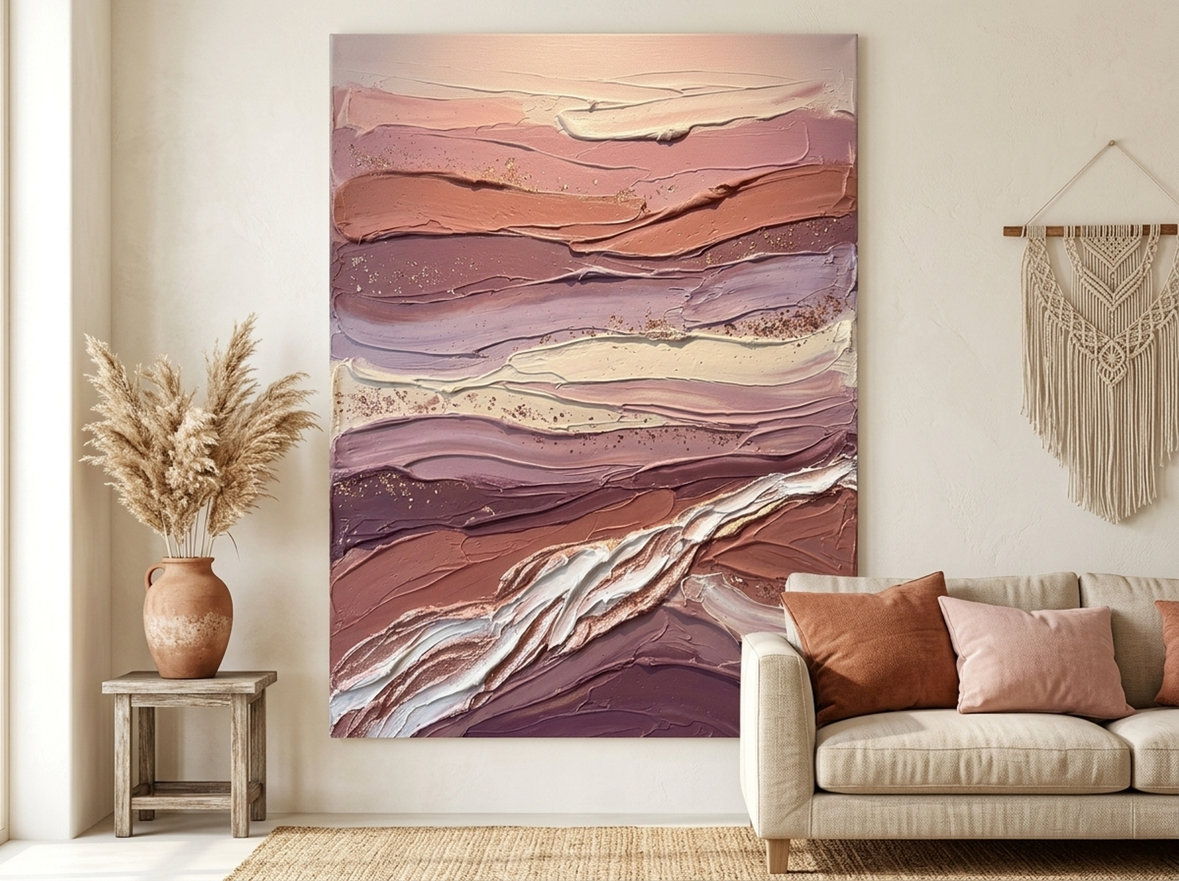
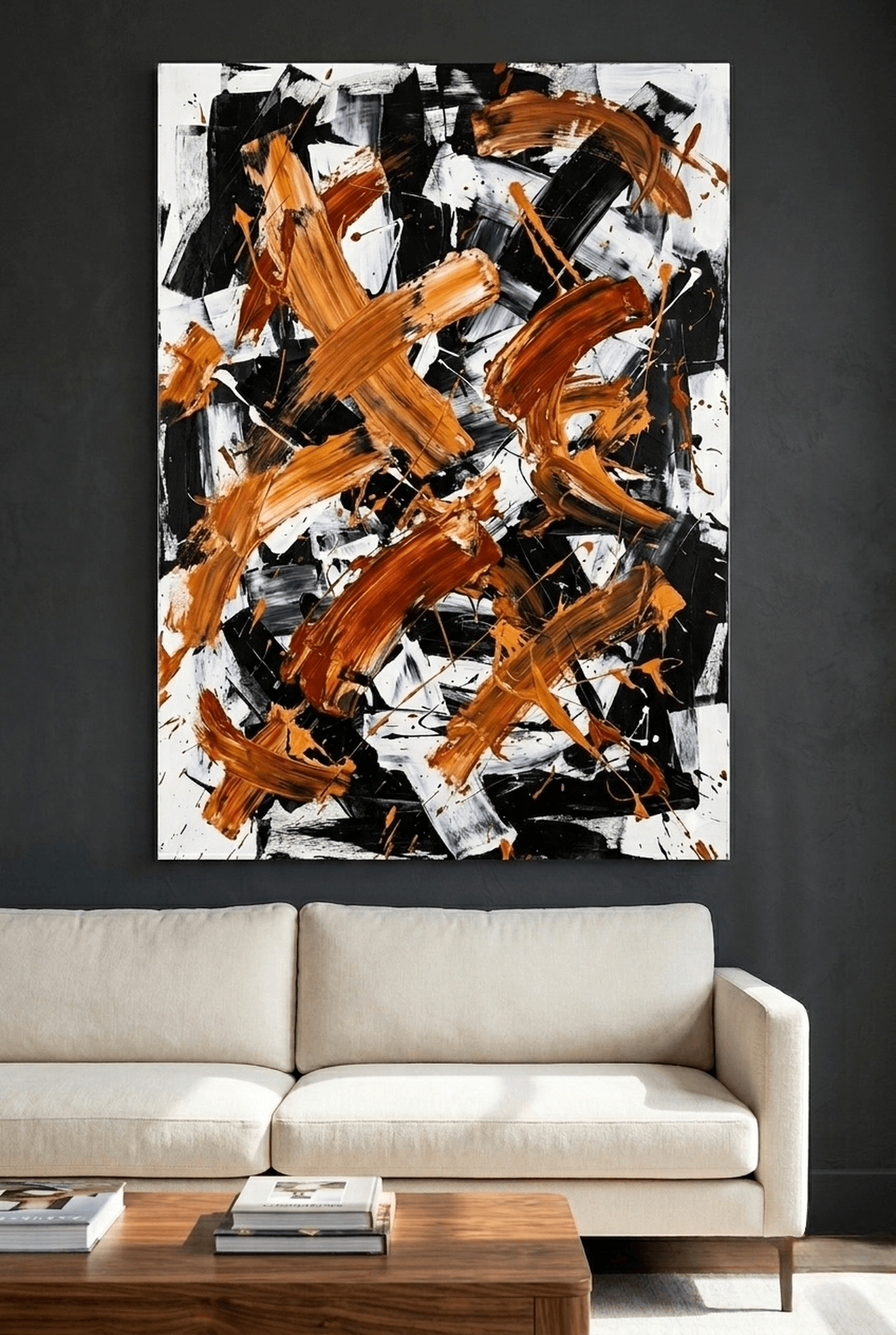
The Canyon Strata canvas above demonstrates how a single bold landscape piece can anchor a gallery wall with its warm earth tones and textured brushwork. Pair it with complementary warm-palette pieces for a cohesive arrangement.
Shop Canyon Strata Canvas Wall Art
3. Gallery Wall Layout Types
Not all gallery walls follow the same blueprint. The layout you choose depends on your wall dimensions, the number of pieces you have, and the overall mood you want to create. Here are five proven arrangements.
Grid layout. Every frame is the same size, hung in precise rows and columns with uniform spacing. This is the cleanest, most modern approach and the easiest to execute. Grid layouts work especially well with matching frames and a single art medium. They communicate order, minimalism, and intentionality. Use this layout when you want calm visual structure.
Salon style. Frames of varying sizes fill the space asymmetrically, covering most of the wall in an organic, collected arrangement. This is the classic gallery look, named after the floor-to-ceiling picture hangs in Parisian salons. The key to salon style is maintaining consistent spacing despite different frame sizes. Without uniform gaps, it looks chaotic rather than curated. Use this layout when you want a sense of abundance and creative energy.
Linear row. Frames are hung in a single horizontal line, aligned at their vertical centers. This layout works beautifully in hallways, above kitchen benches, and in rooms with low ceilings where a tall arrangement would feel overwhelming. Linear rows are simple but effective, drawing the eye along the wall and creating a sense of horizontal movement.
Centered anchor. One larger piece occupies the visual center, with smaller pieces arranged symmetrically around it. This layout creates a clear focal point and works especially well above sofas and beds where the anchor piece relates to the furniture below. The surrounding smaller pieces add visual interest without competing with the central star.
Staircase cascade. Frames follow the diagonal line of a staircase, rising from the lower landing to the upper floor. The vertical center of each frame maintains a consistent distance from the stair treads. This layout turns an often-neglected wall into a dramatic feature.
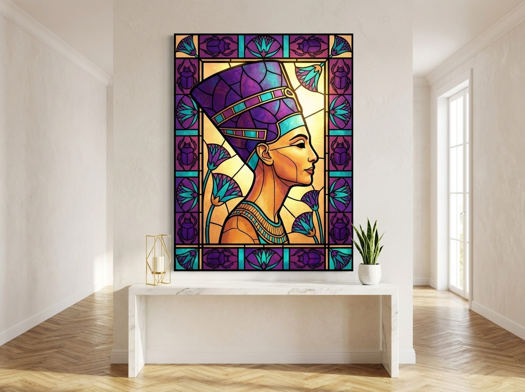
The Nefertiti Stained Glass canvas brings a regal cultural statement to any gallery wall. Its rich amethyst and turquoise tones pair beautifully with gold-framed companions in a salon-style arrangement.
Shop Nefertiti Stained Glass Canvas Wall Art
4. Choosing a Cohesive Theme
A gallery wall without a unifying thread looks like a yard sale. The individual pieces might each be stunning, but if nothing connects them, the overall effect is disjointed. Professional designers rely on at least one of these unifying elements.
Color palette. Choose pieces that share a common color story. They do not need to be identical in color, but the overall palette should feel related. All warm tones, all black and white, or all pieces containing at least one shade of blue. When you squint at the gallery wall and the colors blur together harmoniously, you have achieved palette cohesion.
Subject matter. Botanical prints, landscape photography, abstract art, wildlife paintings, or cultural portraits each create a focused theme. Mixing too many unrelated subjects looks chaotic. Commit to one or two related themes for a curated, intentional feel.
Frame style. Matching frames instantly unify even diverse images. All black frames, all natural wood, or all white frames create a structured, professional appearance. This is the easiest cohesion shortcut and works even when art subjects and color palettes vary. Our canvas prints ship in four frame colors (black, white, espresso, and natural wood), so you can match across your entire gallery.
Art medium. All canvas prints, all framed photographs, or all watercolor-style pieces share a visual texture that creates unity. Mixing too many media types (one canvas, one glossy photo, one sketch, one watercolor) in a small gallery can feel disjointed. For a six-piece wall, stick to one or two media types.
For your first gallery wall, choose at least one strong unifying element. As you gain confidence, experiment with more eclectic combinations. Typically, six to twelve pieces create a substantial gallery wall. Fewer than five looks sparse; more than fifteen risks overwhelming the space.
For more guidance on selecting art that works together, see our post on the best abstract wall art for living rooms.
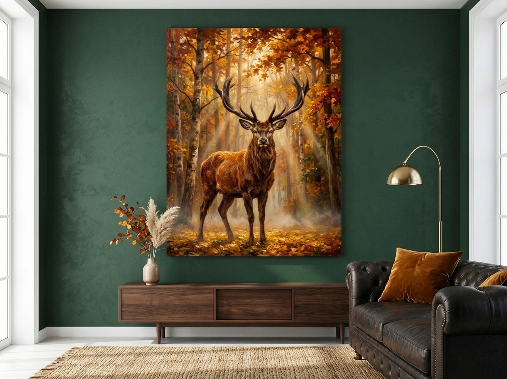
Wildlife art like this Deer Stag canvas adds warmth and natural beauty to any gallery wall. Its autumn palette of amber, rust, and forest green pairs perfectly with landscape prints and botanical subjects.
Shop Deer Stag Canvas Wall Art
5. Our 6 Gallery Wall Picks
We selected six pieces from our collection that represent different styles, subjects, and color stories. Each one works as a standalone statement piece or as part of a larger gallery arrangement. Mix and match to build a wall that reflects your personal aesthetic.
| Pick | Canvas Print | Style | Best For | Link |
|---|---|---|---|---|
| 1 | Canyon Strata Canvas Wall Art | Impasto Landscape | Living rooms, earth-tone galleries | View |
| 2 | Nefertiti Stained Glass Canvas Wall Art | Cultural Portrait | Statement walls, salon-style galleries | View |
| 3 | Deer Stag Canvas Wall Art | Wildlife Oil Painting | Bedrooms, nature-themed galleries | View |
| 4 | Lotus Flower Canvas Wall Art | Minimalist Gold Leaf | Zen spaces, minimalist galleries | View |
| 5 | African Elder Portrait Canvas Wall Art | Expressionist Portrait | Cultural galleries, warm-tone walls | View |
| 6 | Northern Lights Canvas Wall Art | Aurora Landscape | Bedrooms, cool-tone galleries | View |
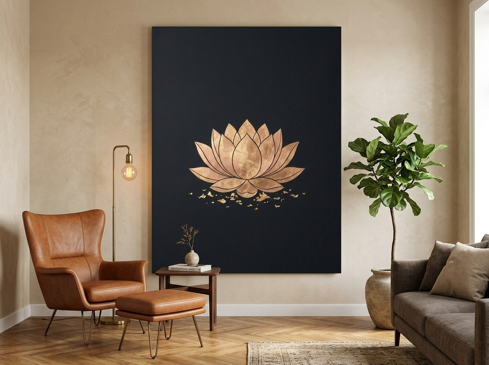
The Lotus Flower canvas brings zen-like calm to any gallery wall. Its gold leaf details and black background create striking contrast, making it an ideal focal point for a minimalist or centered-anchor layout.
Shop Lotus Flower Canvas Wall Art
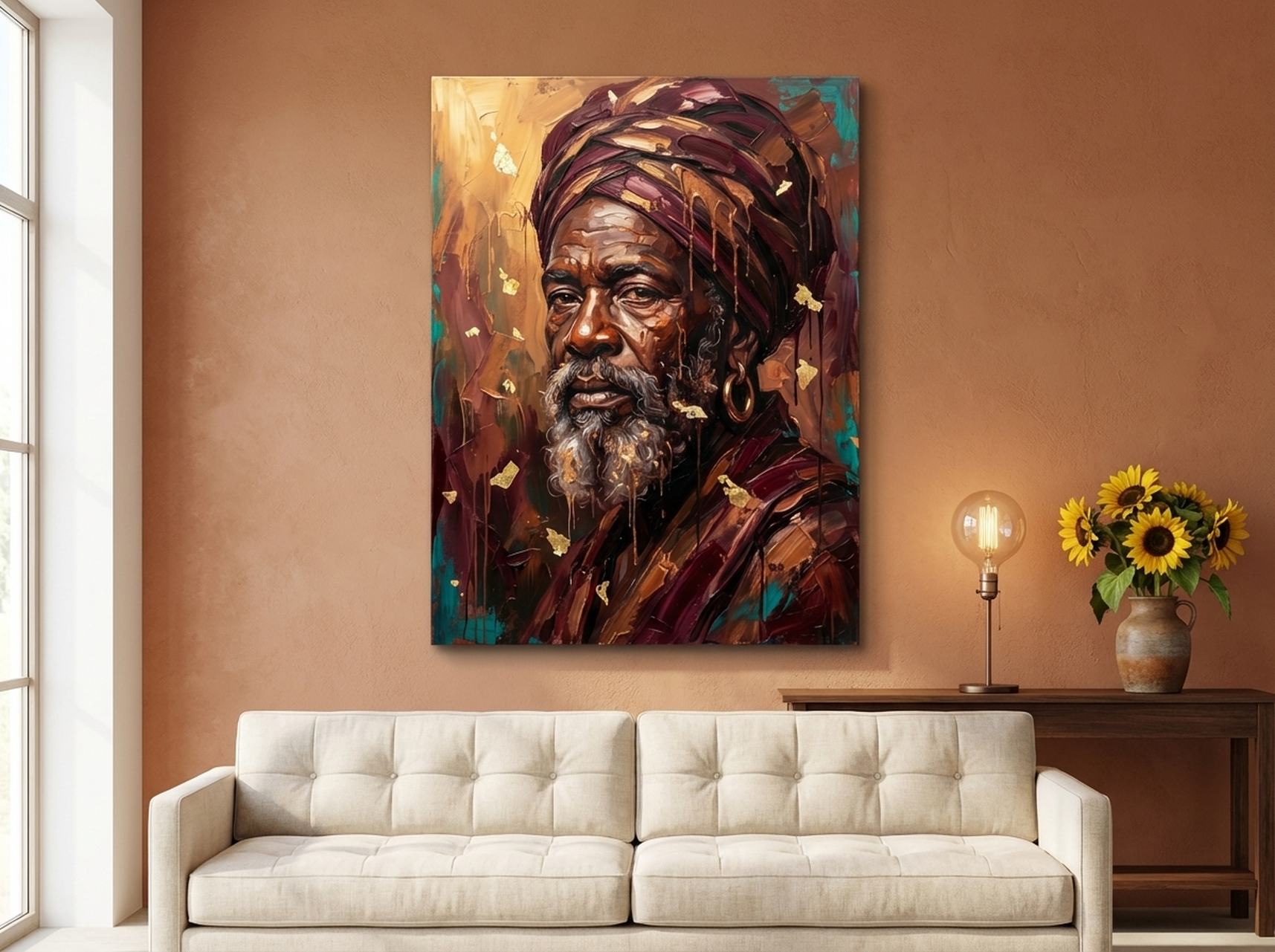
This African Elder Portrait captures raw emotional depth through bold, expressionist brushwork. The rich burgundy and gold tones make it a commanding anchor piece for cultural or warm-toned gallery walls.
Shop African Elder Portrait Canvas Wall Art
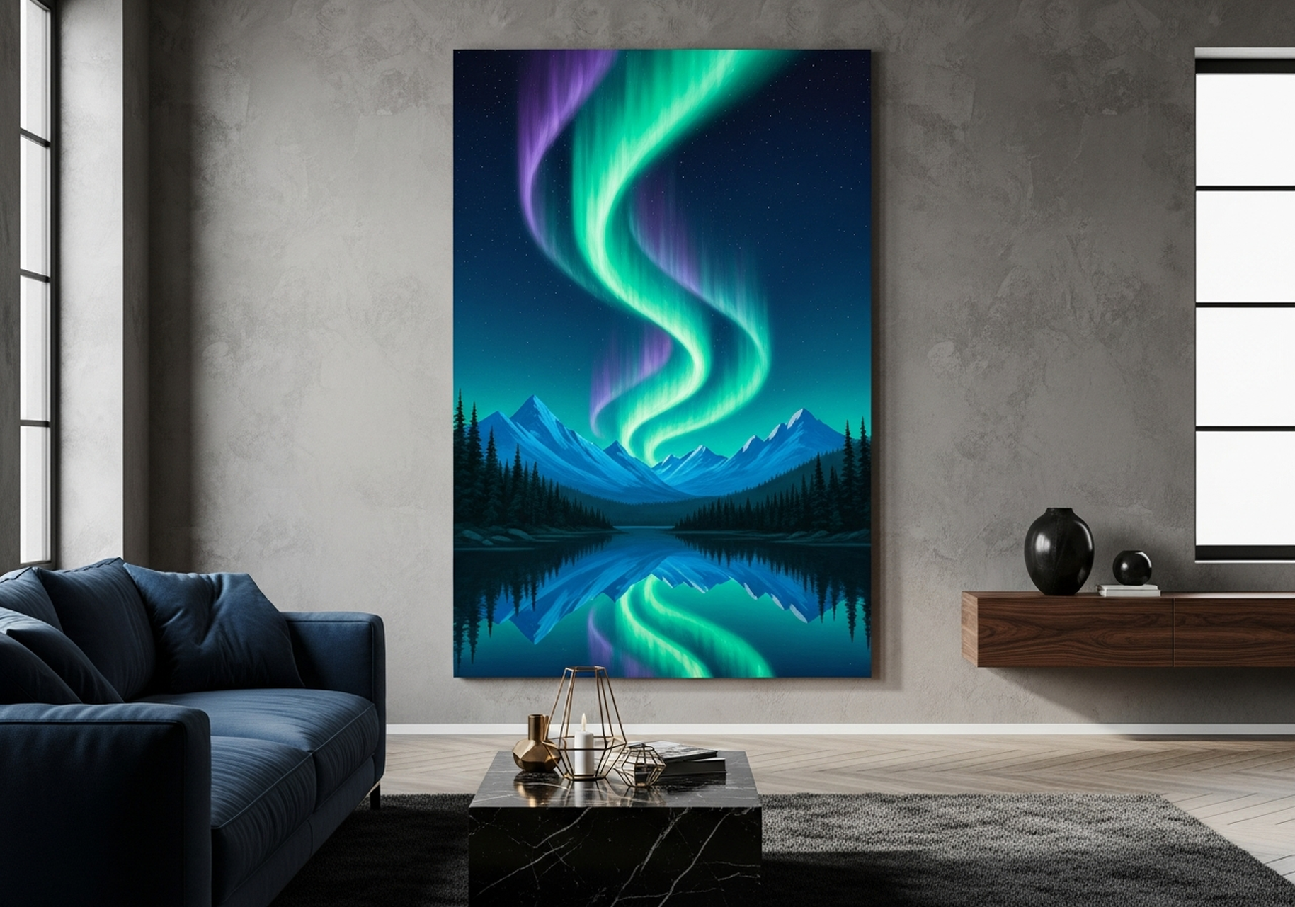
The Northern Lights canvas captures the aurora borealis reflected in a mountain lake. Cool blues and greens make it a natural pairing with other landscape prints in a nature-themed gallery.
Shop Northern Lights Canvas Wall Art
6. Step-by-Step Hanging Guide
You have measured, planned, and selected your art. Now it is time to put everything on the wall. Follow these steps in order for the smoothest experience.
Step 1: Gather your tools. You need a tape measure, a pencil, a level (a phone app works), a hammer, picture hooks or nails, painter's tape, and a cardboard spacer cut to your chosen gap width (5 to 8 cm / 2 to 3 inches).
Step 2: Mark the center height. Measure 145 cm (57 inches) up from the floor and make a light pencil mark. This is the standard museum hanging height, which places art at comfortable eye level for most viewers. If hanging above furniture, position the bottom of the lowest frame 15 to 25 cm (6 to 10 inches) above the furniture top.
Step 3: Create paper templates. Trace each frame onto kraft paper or newspaper. Cut out the shapes and write the frame dimensions and hanging wire location on each template. Mark the nail point on the paper template by measuring from the top of the frame to where the hanging wire sits when taut.
Step 4: Tape the templates to the wall. Using painter's tape, attach your paper cutouts to the wall in the planned arrangement. Use your cardboard spacer to maintain consistent gaps. Step back to the primary viewing distance and evaluate. Adjust until the composition feels balanced. Take a photo for reference.
Step 5: Hang the anchor piece first. For salon-style layouts, start with the largest or most central piece. For grid layouts, start with the top-left piece. Drive the nail or picture hook through the paper template at the marked nail point. Remove the paper. Hang the frame and check with your level.
Step 6: Work outward. Using the anchor piece as your reference, hang adjacent pieces one by one. Use your spacer between each pair of frames. Check level after every frame. For grid layouts, complete one row before moving to the next.
Step 7: Final check. Stand at the room's main viewing point. Look for tilted frames, inconsistent gaps, and overall balance. Take a photo. Adjust anything that looks off while your tools are still out. Remove any remaining paper templates and erase pencil marks.
For a deeper dive into hanging techniques and hardware options, read our complete guide to hanging wall art.
7. Five Common Gallery Wall Mistakes
Even experienced decorators make these errors. Knowing them in advance helps you avoid patching unnecessary holes and starting over.
Mistake 1: Inconsistent spacing. This is the most common problem. Gaps that vary by even 1 cm are noticeable when frames are side by side. Always use a physical spacer rather than eyeballing the distance. Your eyes will deceive you; a cardboard spacer will not.
Mistake 2: Hanging too high. Most people hang art too high, especially when working without a measurement reference. The center of your arrangement should be at 145 cm (57 inches) from the floor, not 170 cm or higher. When the art is too high, viewers have to crane their necks, and the gallery feels disconnected from the furniture below.
Mistake 3: No unifying element. A gallery wall with six unrelated pieces in six different frame colors, sizes, and styles looks like a flea market display. Choose at least one common thread: matching frames, a shared color palette, or a consistent subject matter. Cohesion is what makes a collection look curated rather than random.
Mistake 4: Skipping the planning step. Driving nails directly into the wall without a paper template or floor layout is a recipe for misaligned frames and extra holes. The twenty minutes you spend arranging paper cutouts on the wall saves an hour of frustration and wall repair later.
Mistake 5: Ignoring the room context. A gallery wall does not exist in isolation. It relates to the furniture below it, the lighting above it, and the architectural features around it. A gallery wall that extends wider than the sofa beneath it looks unbalanced. One that sits too close to a doorframe feels cramped. Always consider the full room context when planning your arrangement.
For guidance on choosing the right size pieces for your space, see our wall art sizing guide.
8. Frequently Asked Questions
How many pieces do I need for a gallery wall?
Most gallery walls work best with six to twelve pieces. Fewer than five can look sparse and unfinished, while more than fifteen risks overwhelming the space. Start with six or seven pieces and add more over time as you find art you love. The beauty of a gallery wall is that it can grow and evolve.
What is the ideal spacing between gallery wall frames?
The standard spacing is 5 to 8 cm (2 to 3 inches) between frames. For larger pieces over 60 cm wide, increase to 8 to 10 cm (3 to 4 inches). For smaller pieces under 30 cm, tighten to 4 to 5 cm (1.5 to 2 inches). The key is keeping the spacing consistent throughout the entire arrangement.
Can I mix different frame sizes in a gallery wall?
Yes, and mixing sizes often creates the most visually interesting gallery walls. Salon-style layouts rely on varied frame sizes arranged asymmetrically. The key to making mixed sizes work is maintaining consistent spacing between all pieces and using at least one unifying element like matching frame colors or a shared color palette in the artwork.
What height should I hang my gallery wall?
The center of your gallery wall arrangement should be approximately 145 cm (57 inches) from the floor. This is the standard museum hanging height and places art at comfortable eye level for most adults. If hanging above a sofa or console table, the bottom edge of the lowest frame should sit 15 to 25 cm (6 to 10 inches) above the furniture.
Do your canvas prints come framed and ready to hang?
Every canvas print in our collection ships in a sturdy frame with pre-installed hanging hardware. Choose from four frame colors: black, white, espresso, or natural wood. The canvas is printed on premium matte material and arrives ready to hang straight out of the box. No additional framing required.
How do I prevent my gallery wall from looking cluttered?
Three things prevent clutter: consistent spacing, a unifying element, and restraint. Use a physical spacer to maintain uniform gaps between every frame. Choose at least one common thread across all pieces, whether that is matching frames, a shared color palette, or a consistent subject matter. And leave some breathing room around the arrangement so it does not crowd the wall from edge to edge.
9. Quick Reference Table
| Parameter | Recommended Range |
|---|---|
| Spacing between frames | 5-8 cm (2-3 in) |
| Large piece spacing | 8-10 cm (3-4 in) |
| Small piece spacing | 4-5 cm (1.5-2 in) |
| Center height from floor | 145 cm (57 in) |
| Gap above furniture | 15-25 cm (6-10 in) |
| Gallery width vs wall | 57-75% of available width |
| Gallery width vs sofa | No wider than the sofa |
| Ideal number of pieces | 6-12 |
| Outer margin multiplier | 1.5x internal spacing |
Ready to Build Your Gallery Wall?
Every piece in our collection is a gallery-quality framed canvas print that arrives ready to hang. Free US shipping on all orders.