Wall Art for White Walls: Add Personality and Color to Any Room
The Heva Team
Art Curators & Interior Design Enthusiasts · April 2, 2026 · 9 min read
White walls are the ultimate blank canvas, and that is exactly their superpower. Far from being boring or clinical, white walls give your art the spotlight it deserves, the way a museum frames masterpieces against neutral backgrounds so nothing competes with the work itself. The real question is not whether wall art for white walls can look good; it is which pieces will truly sing on that clean, light-reflecting surface.
Ready to find your perfect piece? Browse the full Heva collection.
The White Wall Advantage
Interior designers consistently praise white walls for one simple reason: they make everything else look better. White reflects up to 80 percent of available light, keeping rooms feeling bright and open even without abundant natural light sources. That reflectivity also means that art on white walls benefits from better, more even illumination, making colors appear truer and more vibrant than they would against colored or dark walls.
White walls also give you unmatched flexibility. A home with white walls can pivot from Scandinavian minimalism to maximalist bohemian to mid-century modern simply by changing the art, furniture, and accessories. You are never locked into a single aesthetic. This adaptability makes white walls one of the most practical choices for renters and homeowners who love to refresh their spaces regularly.
The key to making white walls look intentional rather than unfinished lies in the art you choose. Without color on the walls themselves, your art carries the entire visual story of the room. This means you need pieces with genuine presence: strong colors, compelling subjects, or interesting textures that justify the clean backdrop they are given.
From bold typography prints to rich portraiture, from geometric abstracts to vivid wildlife, the spectrum of art that works on white walls is enormous. The challenge is not finding something that works; it is finding the combination that feels most like you.
Color Strategies That Work
When choosing art for white walls, think in terms of contrast, warmth, and intention. White walls provide a neutral base, so the color strategy you employ with your art determines whether the room feels cool and contemporary, warm and inviting, or energetic and expressive.
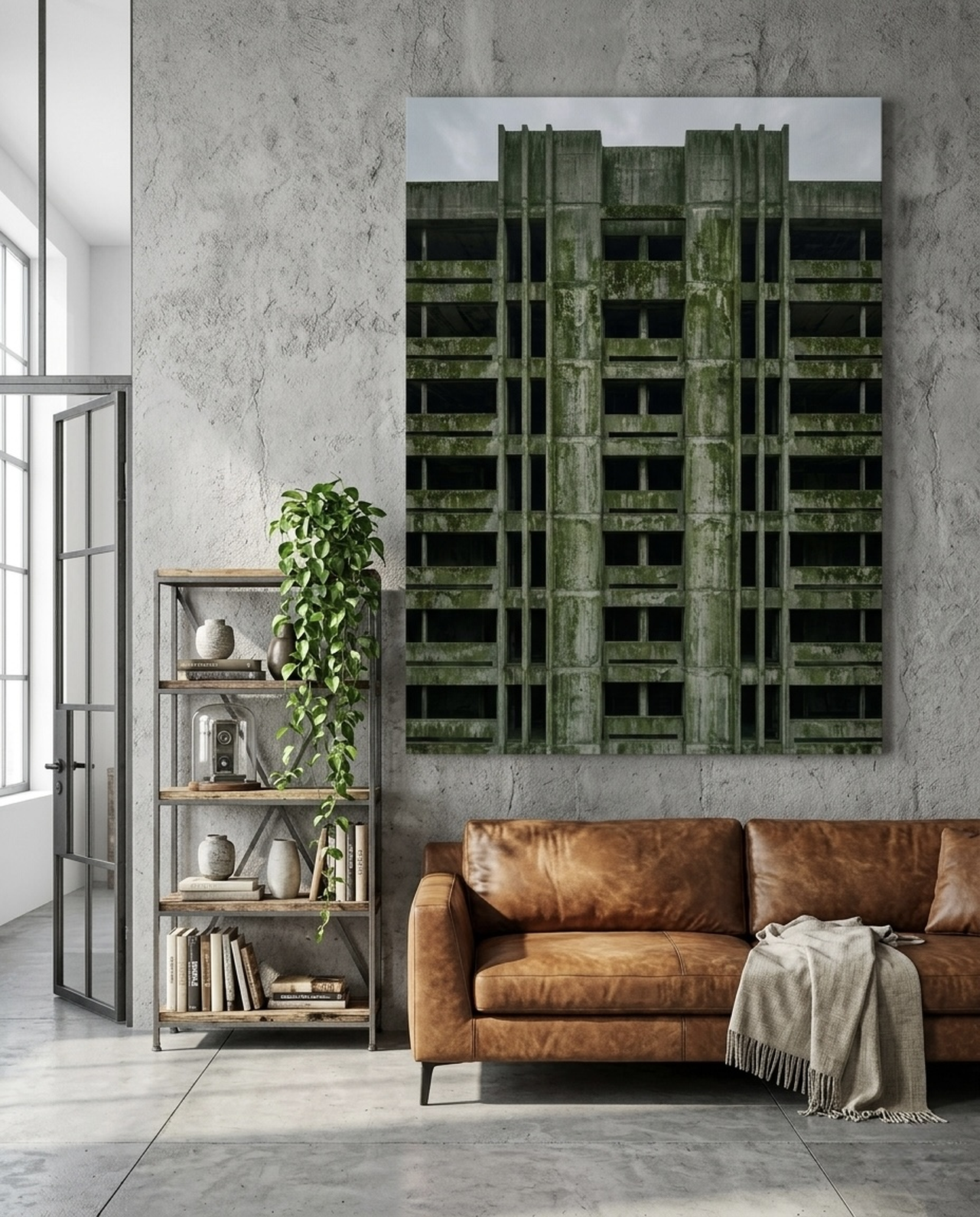
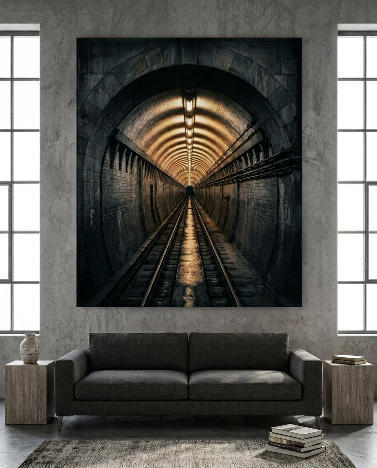
High contrast for drama: Deep navy, charcoal, forest green, and black create powerful contrast against white walls. Typography prints, silhouettes, and graphic art in these tones feel sophisticated and deliberate. A single large charcoal piece on a white wall can anchor an entire room with quiet authority. This approach works especially well in home offices, dining rooms, and masculine spaces where gravitas is desired.
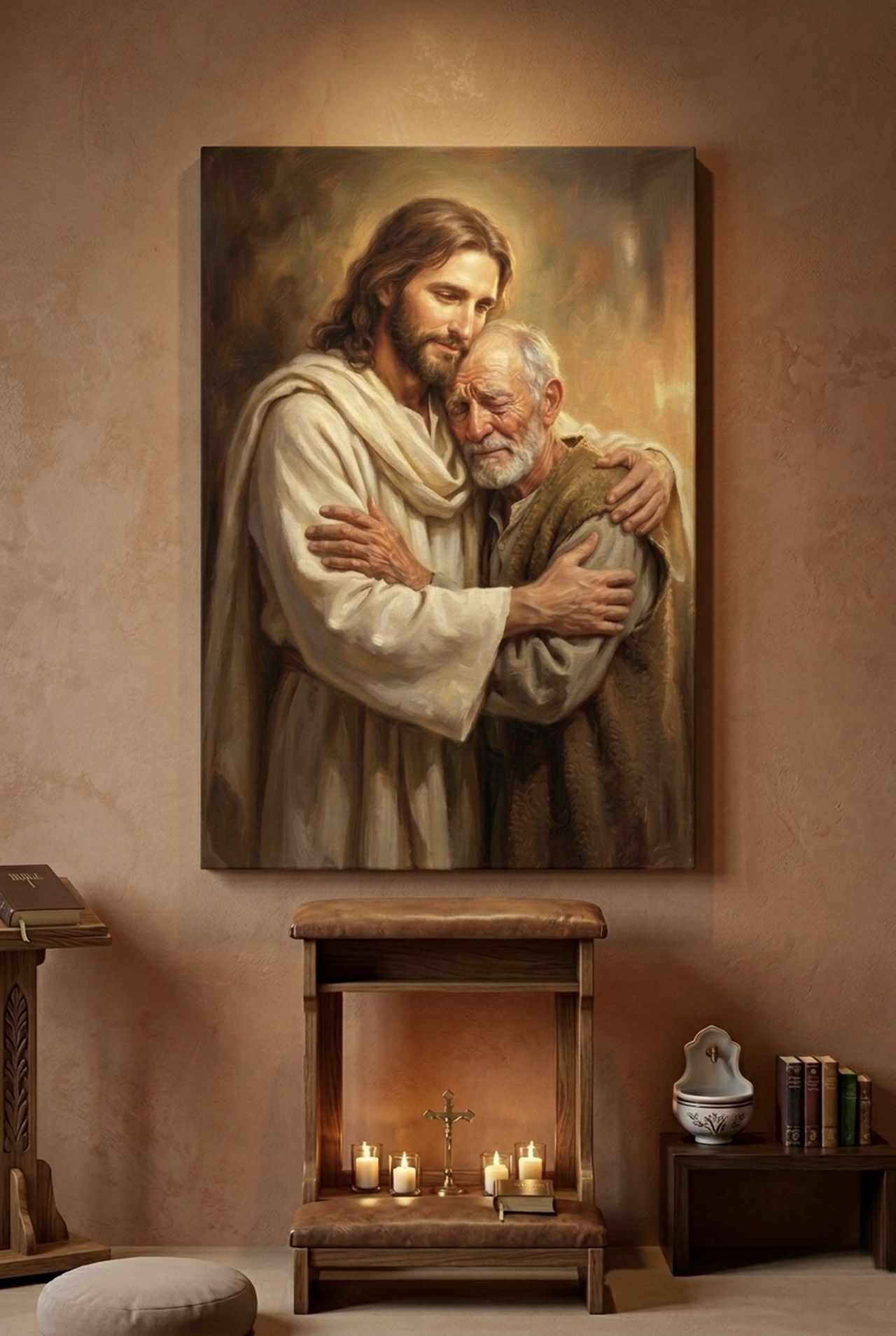
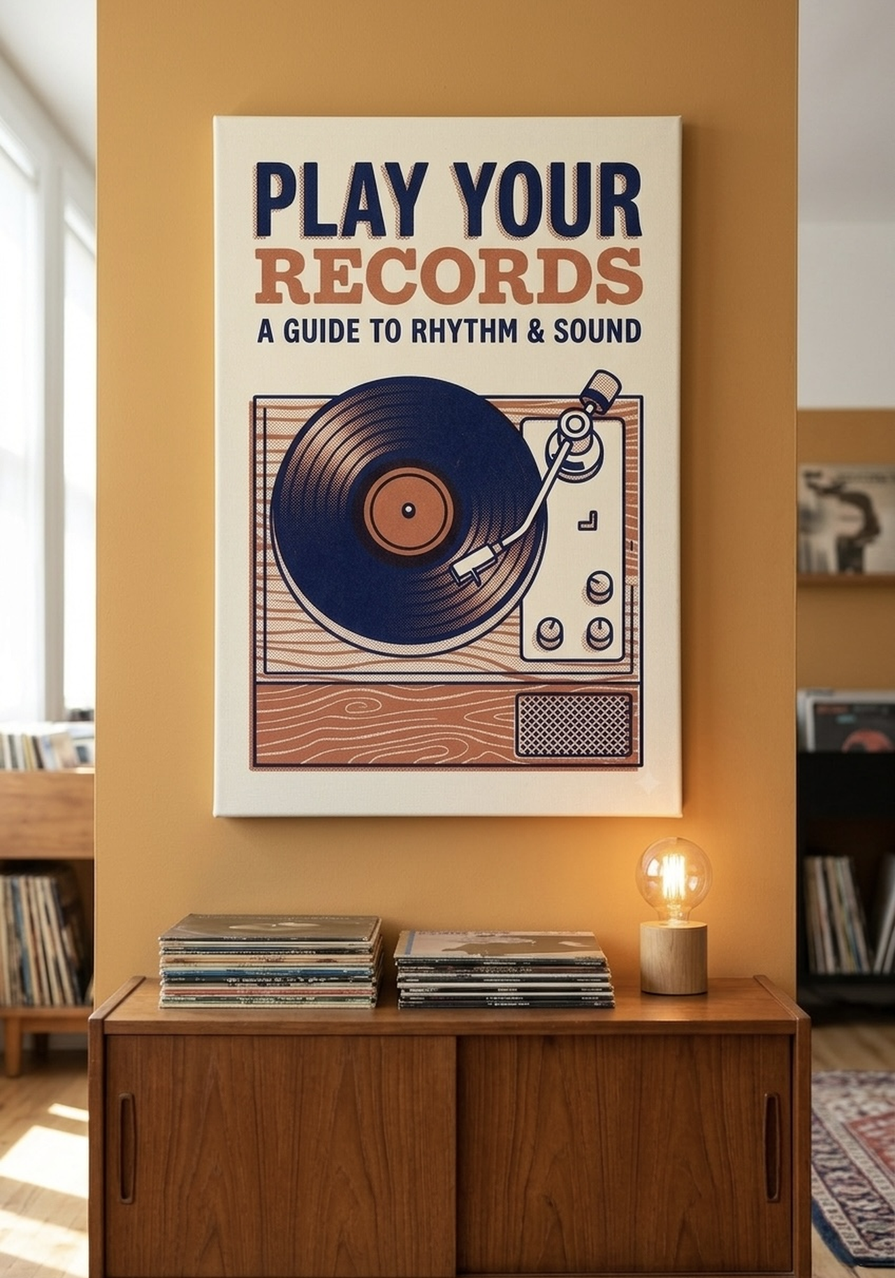
Warm accents for coziness: Terracotta, amber, gold, and burnt sienna add warmth that prevents white rooms from feeling cold or clinical. These tones pair beautifully with natural materials like wood, rattan, and linen, creating an earthy, inviting atmosphere. A warm terracotta print on a white wall is one of the simplest ways to make a space feel lived-in and welcoming.
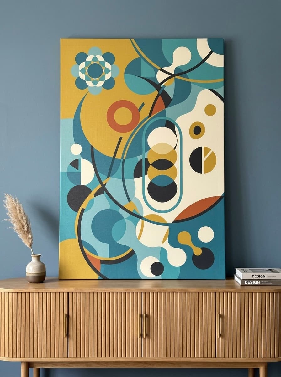
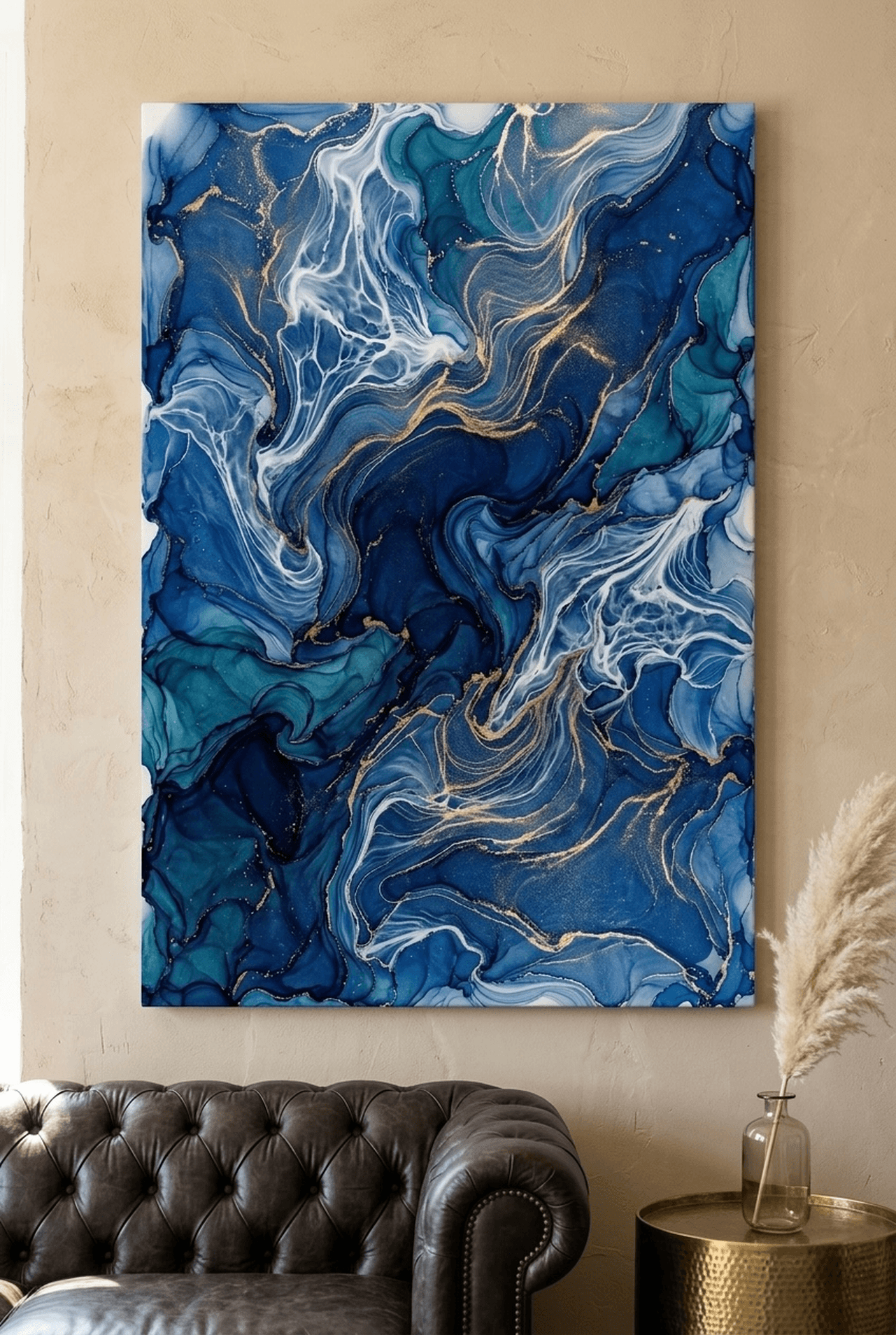
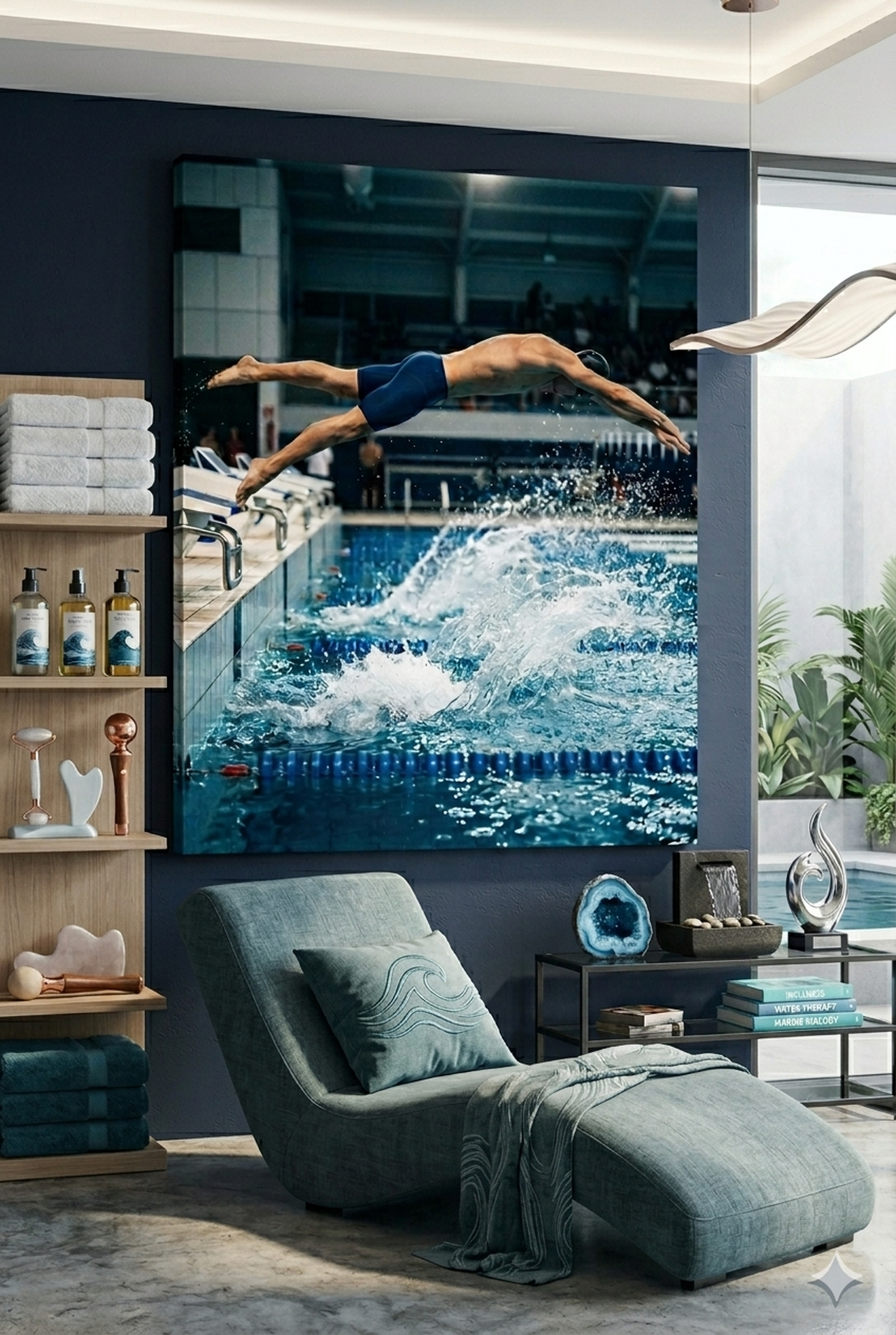
Bold jewel tones for vibrancy: Sapphire blue, deep emerald, and rich burgundy make white walls sing. These colors have the intensity to compete with the brightness of white walls without being harsh. Portrait art, editorial prints, and geometric pieces in jewel tones create rooms that feel confident and curated.
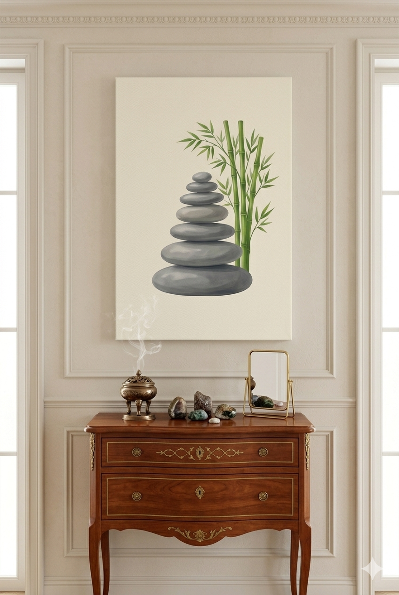
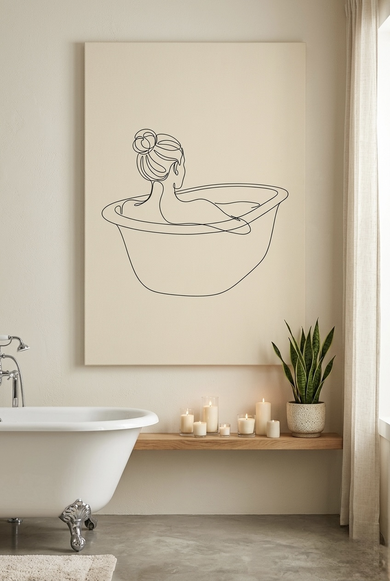
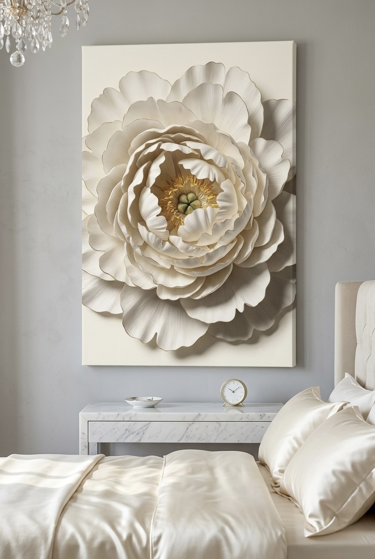
Soft neutrals for elegance: Sand, ivory, pale sage, and blush create sophisticated tonal contrasts against white. These palettes are ideal for bedrooms, nurseries, and spaces where calm contemplation is the goal. Minimalist wildlife art, delicate botanical prints, and soft abstract pieces in these tones achieve an understated luxury that feels timeless.
You can also use multiple color strategies across a room, anchoring it with one high-contrast piece and layering in warmer or softer accents. The rule of three (one statement, two supporting works) keeps the combination cohesive without becoming monotonous.
Style Guide by Room
Different rooms call for different approaches to art on white walls. Here is how to tailor your choices:
White-walled living rooms are where you make your biggest statement. Choose a canvas that is genuinely large, at least 24x18 inches (61x46 cm) and ideally 32x24 inches (81x61 cm) or more for standard-sized rooms. Bold portraiture, large-scale typography, or graphic abstract pieces with strong color deliver the visual weight that a white wall living room needs. Do not let the space intimidate you into choosing something small; white walls demand confidence.
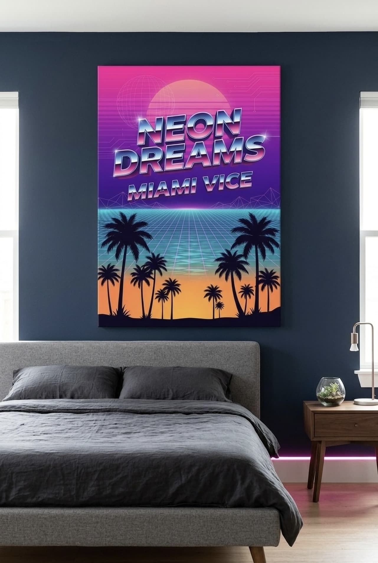
White-walled bedrooms benefit from art that is strong enough to read from across the room but calming enough to live with every day. Minimalist wildlife prints, soft geometric patterns, and muted typographic pieces all strike this balance. Above the bed is prime real estate: a wide horizontal canvas (at least as wide as the headboard) creates a unified, intentional look that feels professionally designed.
White-walled home offices and studios thrive with art that is motivating and engaging. Typography prints with powerful messages, editorial portraits of historical figures, and bold graphic art all work beautifully here. White office walls paired with strong motivational art create an environment that actively supports focus, ambition, and creative thinking.
White-walled hallways and entryways are perfect for creating a gallery-style display. A series of three to five pieces in coordinating tones creates a cohesive collection without requiring every piece to be the same subject or style. Mix portrait sizes for visual interest, and use consistent frame styles to unify the display.
Our Top Picks for White Walls
Each of these pieces has been selected for its ability to truly come alive against a white backdrop. Strong colors, compelling subjects, and high-quality canvas printing ensure that each one delivers maximum visual impact.
Sizing and Placement Guide
On white walls, getting the size right is especially critical. Art that is too small disappears into the white expanse; art that is correctly sized commands the space.
Living room primary wall: Aim for 32x24 inches (81x61 cm) or larger for standard rooms. Leave at least 8 inches (20 cm) of white wall visible on all sides so the art does not feel cramped. The visual center should sit at 57 to 60 inches (145 to 152 cm) from the floor.
Above a console or sideboard: Art should be roughly the same width as the furniture below it (within 10 percent narrower). For a 48-inch (122 cm) console, aim for a canvas 40 to 48 inches (102 to 122 cm) wide. Leave 6 to 9 inches (15 to 23 cm) between the top of the furniture and the bottom of the frame.
Gallery wall on white: Keep consistent spacing between pieces (3 to 4 inches / 7.5 to 10 cm is the classic range). Sketch your arrangement on paper or use painter's tape on the wall before committing nail holes. A mix of sizes looks most natural, with the largest piece serving as the visual anchor at the center or slightly above center of the arrangement.
5 Common Mistakes to Avoid
- Choosing art that is too small: This is the most common mistake on white walls. Without color on the walls to visually fill the space, undersized art feels accidental rather than intentional. When in doubt, go one size up.
- Using a palette that is too similar to white: Very pale, cool prints get lost against white walls. Your art should provide clear tonal contrast, whether through dark tones, warm mid-tones, or saturated color.
- Ignoring frame choice: On white walls, the frame is part of the art. A black frame on white creates bold graphic contrast. A natural wood frame adds warmth. A white frame creates a clean, gallery-like minimalism. Each choice sends a different design message, so choose intentionally.
- Overloading the wall: White walls are powerful partly because of the white space they preserve. Packing every inch with art destroys the clean, airy quality that makes white walls so appealing. Edit ruthlessly, letting breathing room work in your favor.
- Forgetting about lighting: White walls reflect ambient light generously, but adding a dedicated picture light or directional spot above your primary art piece elevates the entire room. Even a simple clip-on picture light transforms a good piece into something gallery-worthy.
Frequently Asked Questions
What colors of wall art look best on white walls?
Deep navy, charcoal, rich terracotta, emerald green, and warm gold all create beautiful contrast against white walls. The key is ensuring your art has enough tonal depth to stand out rather than blending into the white background. Avoid very pale or icy colors on bright white walls.
How large should wall art be on white walls?
As a general rule, go larger than you think you need. For a white-walled living room, a canvas measuring at least 24x18 inches (61x46 cm) is the minimum for visual impact, and 32x24 inches (81x61 cm) is better for average-sized walls. Leave 6 to 8 inches (15 to 20 cm) of white wall visible around the piece.
Can I mix different art styles on white walls?
Absolutely. White walls are the ideal backdrop for eclectic mixing because the consistent backdrop creates visual cohesion even when the art styles vary. The key is coordinating the color palettes across different pieces so they feel like a curated collection rather than a random assortment.
Should frames match on white walls?
Not necessarily, but consistency helps. Matching frame finishes (all black, all natural wood, or all white) creates the most polished look. If mixing frames, stick to no more than two finishes to maintain visual coherence.
Is white wall decor hard to maintain?
White walls show scuffs and marks more readily than colored walls, but they are also easy to touch up with a small amount of matching paint. The visual benefits, brightness, flexibility, and the way they showcase art, far outweigh the minor maintenance considerations for most homeowners.
How many art pieces should I hang on a white wall?
One large, confident statement piece often makes more impact on a white wall than multiple smaller works. If you prefer a gallery approach, three to five coordinating pieces in a cohesive color palette create a beautiful display without overwhelming the clean backdrop.
Quick Reference: Wall Art for White Walls
| Goal | Art Style | Best Colors |
|---|---|---|
| Drama and impact | Bold typography, graphic prints | Charcoal, navy, black |
| Warmth and coziness | Vintage prints, terracotta art | Terracotta, amber, warm gold |
| Vibrant personality | Portrait, editorial, abstract | Sapphire, emerald, burgundy |
| Calm elegance | Minimalist wildlife, botanicals | Sand, pale sage, soft blush |
| Motivational energy | Typography, definition prints | Navy, forest green, charcoal |
| Eclectic gallery wall | Mixed styles with coordinated palette | Two to three colors max |
White walls are waiting for their moment. Give them one. Explore every style at Heva Unique Art Gallery and discover the canvas that will transform your space from blank to breathtaking. Free US shipping, every piece ready to hang.