Retro Wall Art: Vintage Vibes for Modern Homes
The Heva Team
Art Curators & Interior Design Enthusiasts · March 8, 2026 · 16 min read
A complete guide to retro and vintage wall art for modern interiors. Covers Art Deco, mid-century, and 70s styles with curated canvas prints, placement measurements, and styling rules.
Walk into any well-designed room that feels both current and comfortable, and you will almost certainly spot something old: a mid-century sideboard, a 1970s graphic print, a gilded frame that whispers of another century. That tension between past and present is the engine of retro wall art. It borrows the visual language of earlier decades, from Art Deco geometry to groovy psychedelic swirls, and drops it into spaces built around clean lines, neutral sofas, and LED lighting. The result is a room with personality that mass-produced minimalism alone can never deliver. This guide walks you through the eras, the products, and the practical rules so you can add vintage character to your walls without turning your living room into a time capsule.
Ready to browse? Shop the Retro Collection or keep reading for our top picks and expert tips.
Retro vs Vintage: The Distinction That Matters
These two words get swapped constantly, but they mean different things, and knowing the difference helps you shop smarter. Vintage refers to items genuinely made in an earlier period, typically at least 20 years old. A framed poster printed in 1968 is vintage. Retro describes new items that deliberately imitate the style of an earlier era. A canvas print made this year in a 1960s pop-art palette is retro. Both have a place on your walls, but retro art gives you the aesthetic without the fragility, foxing, or framing headaches of true antiques.
For wall art specifically, retro pieces offer a practical advantage: they are printed on archival-quality materials with modern colour accuracy, meaning you get the warmth of a mid-century palette without the fading. Our canvas prints use a pinewood frame system available in black, white, espresso, and natural finishes, so you can match the retro artwork to contemporary furniture without the frame clashing. A vintage teak frame suits a mid-century piece, while a matte black frame bridges any era into a modern setting.
The takeaway: if you want the look of the past with the durability of the present, retro wall art is the smarter investment. Save the true vintage finds for items you can display under glass or in low-light conditions.
Era Guide: Art Deco, Mid-Century, and the Groovy 70s
Retro wall art is not a single style. It spans roughly a century of design movements, each with its own colour rules, geometry, and emotional tone. According to Homes and Gardens, vintage-inspired interiors are among the defining trends for 2026, with designers mixing historical motifs into contemporary spaces. Here is a quick map of the three most popular eras for wall art.
Art Deco (1920s to 1930s)
Think geometric symmetry, metallic accents, and a palette dominated by black, gold, cream, and deep jewel tones. Art Deco was born in Paris and spread through architecture, fashion, and graphic design. In wall art, it shows up as sunburst patterns, stepped geometric forms, and bold typography with inline detailing. The style pairs exceptionally well with modern interiors because both share a love of clean lines, the difference is that Art Deco adds glamour. Hang an Art Deco-inspired print above a marble console table or beside a brass floor lamp for maximum impact.
Mid-Century Modern (1940s to 1960s)
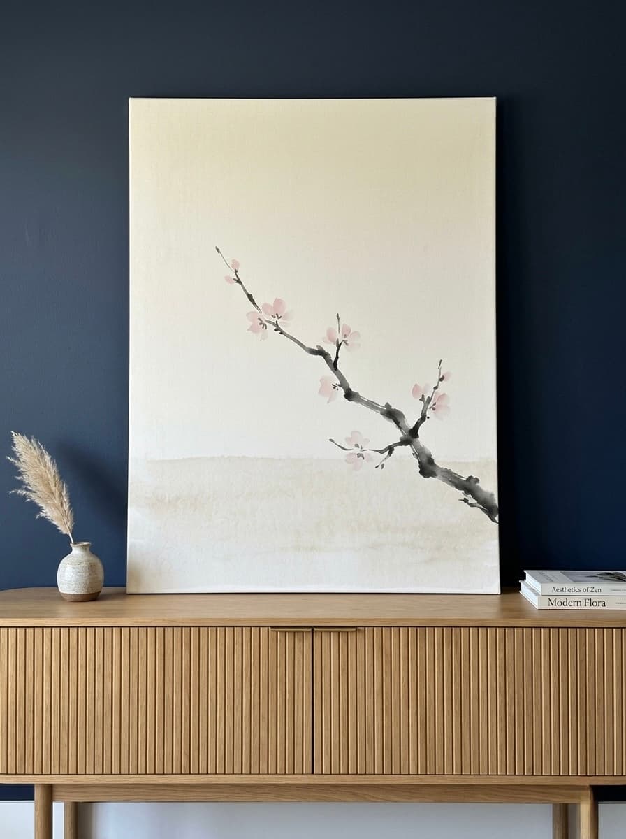
The mid-century palette is instantly recognisable: mustard yellow, avocado green, burnt orange, and teal against warm wood tones. Shapes are organic (think atomic starbursts, boomerangs, and abstracted plant forms) rather than the rigid geometry of Deco. This era's wall art works in almost any room because the colours are warm without being overwhelming. A 60 by 90 cm (24 by 36 inch) mid-century canvas print placed 15 to 20 cm (6 to 8 inches) above a walnut credenza is a textbook styling move that designers use because it simply works every time.
The Groovy 70s (1970s)
The 1970s dialled up the saturation. Colour palettes shifted to rust, terracotta, avocado, harvest gold, and chocolate brown. Patterns became bolder: oversized florals, op-art illusions, and psychedelic swirls replaced the restrained geometry of earlier decades. As Living Etc reports, nostalgic decorating trends are making a strong comeback, with bold, historically inspired colour palettes returning to modern homes. Seventies-style wall art is a high-impact choice for accent walls, especially in rooms with neutral furniture. One large op-art canvas in coral and burgundy can anchor an entire living room without a single other decorative object.
How to Mix Vintage Art With Modern Interiors
The mistake most people make is going all-in on one era. A room where every object screams "1965" stops feeling like a curated home and starts feeling like a film set. The goal is contrast. Here are three rules interior designers use to blend retro wall art into modern spaces.
Rule 1: One Hero Piece Per Wall
Choose one large retro canvas (at least 60 by 90 cm / 24 by 36 inches) as the focal point. Everything else on that wall should be neutral or contemporary. This creates a "spotlight" effect that lets the vintage aesthetic breathe. If you want more retro art, spread it across multiple rooms rather than clustering it in one space.
Rule 2: Match the Frame to the Room, Not the Art
A 1970s-style print does not need a 1970s-style frame. In fact, pairing it with a sleek matte black frame instantly grounds the piece in the present. The pinewood frames available with our canvas prints come in four neutral finishes (black, white, espresso, natural) that bridge any era. For a detailed guide on frame choices, see our post on framed canvas vs unframed canvas.
Rule 3: Limit Your Colour Pull to Two
Pick no more than two colours from the retro artwork and echo them elsewhere in the room through cushions, a throw, or a single decorative object. If your retro print features teal and terracotta, a teal cushion on the sofa and a terracotta vase on the shelf is enough. Pulling every colour from the art into the room overwhelms the eye and dilutes the vintage statement. For more on colour strategy, our psychology of colours in wall art guide breaks down how each hue affects mood and perception.
6 Retro Canvas Prints We Love Right Now
Each of these pieces draws on a different decade or sub-genre of retro design. They are printed on premium matte canvas with a 1.25-inch (3.2 cm) stretcher bar, ready to hang straight out of the box. We have selected them to cover a range of rooms, palettes, and price points.
1. Paris Admit One Retro Ticket Canvas Print
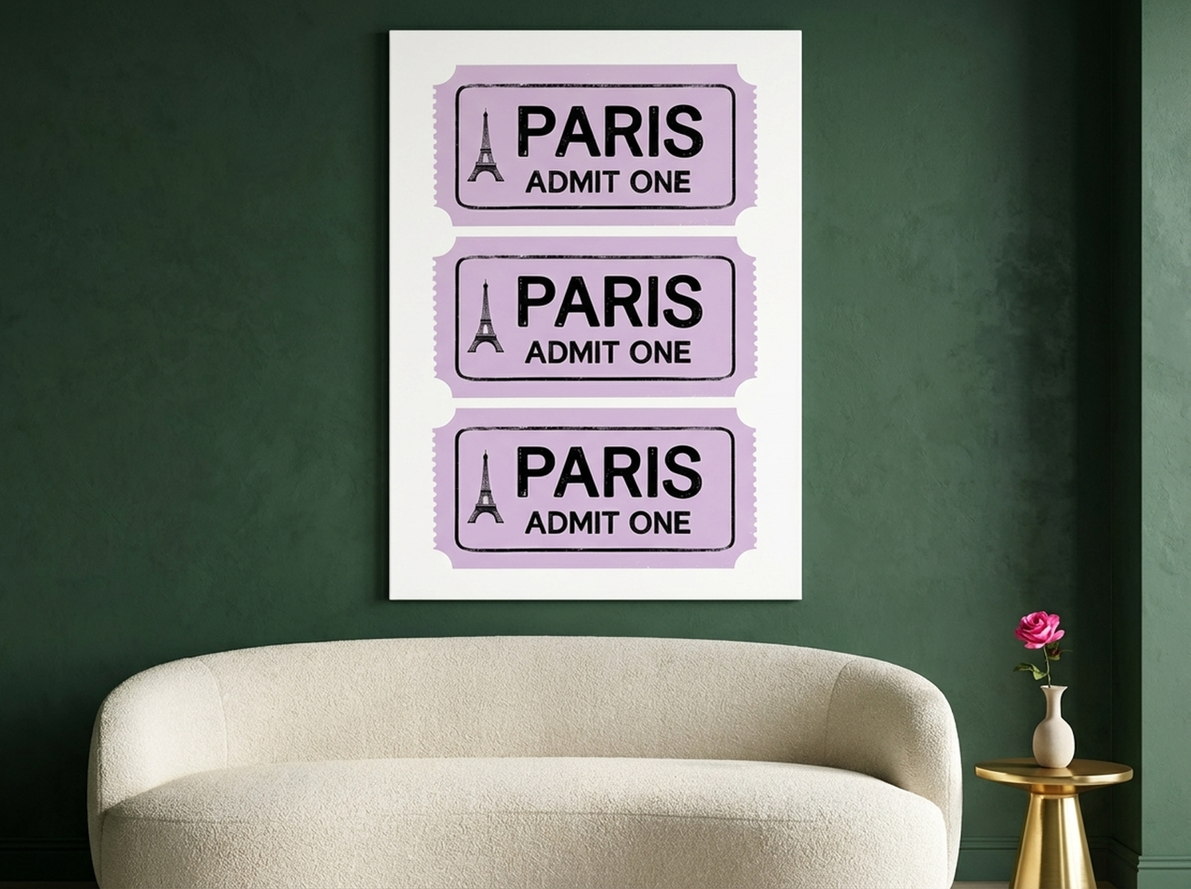
This lavender-and-pink print reimagines a vintage Parisian admission ticket as oversized wall art. The Eiffel Tower illustration sits inside a stamp-style border, and the faded colour treatment gives the piece a genuine aged-paper quality without any actual deterioration. At 60 by 90 cm (24 by 36 inches), it fills the wall above a single bed or reading chair beautifully. The cool lavender palette works particularly well in bedrooms where you want a calming atmosphere with a hint of wanderlust. Pair it with cream bedding and a single brass reading lamp for a travel-inspired retreat.
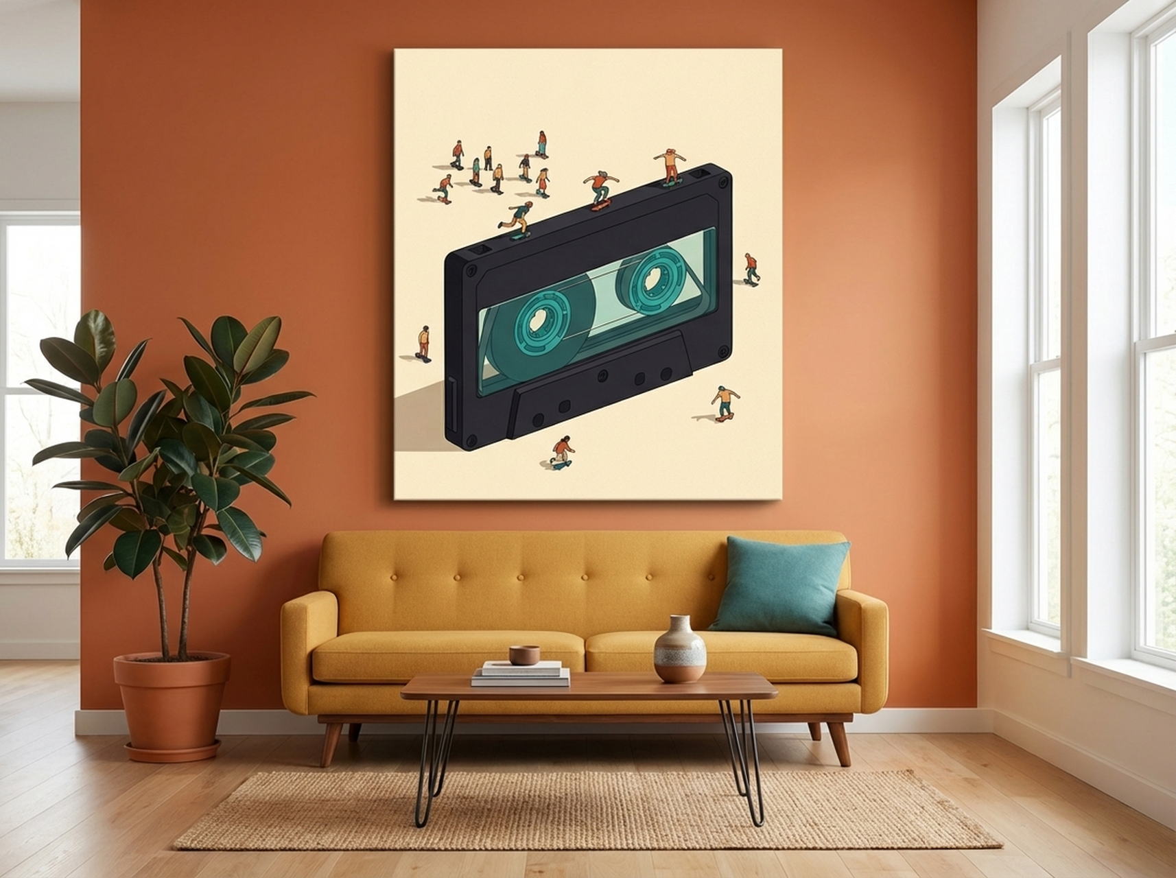
2. Giant Cassette Tape Art Canvas Print
A surreal, oversized cassette tape rendered in charcoal and teal against a cream background. The illustration style blends oil-painting brushwork with graphic design flatness, creating a piece that reads as fine art rather than kitsch. The cassette tape is arguably the most iconic object of 1980s and 1990s culture, and this print captures that nostalgia without leaning into irony. Hang it in a music room, a den with a record player, or a teenager's bedroom. The muted teal accent ties easily into modern colour schemes without clashing. Size it at 50 by 70 cm (20 by 28 inches) for a tight space or go full 60 by 90 cm (24 by 36 inches) as a statement piece.
3. Disco Ball Forest Green Canvas Print
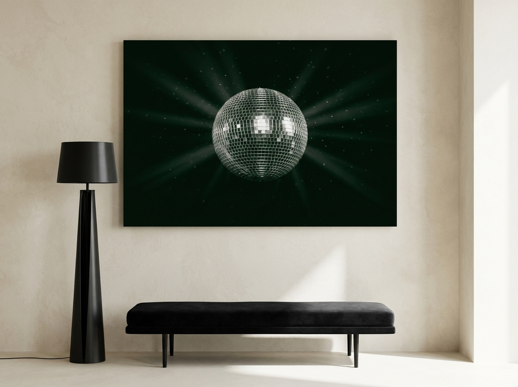
This moody, high-contrast photograph captures a disco ball suspended against deep forest green, with silver highlights cutting through the darkness. It evokes the glamour of late 1970s nightlife without the cheesiness that disco imagery can sometimes carry. The near-monochromatic palette (green, silver, black) makes it one of the most versatile retro prints in the collection. It works above a home bar, in a dining room with dark walls, or even in a bathroom where you want a touch of unexpected glamour. The reflective quality of the disco ball in the photograph naturally draws the eye, so position it where guests will see it first upon entering the room.
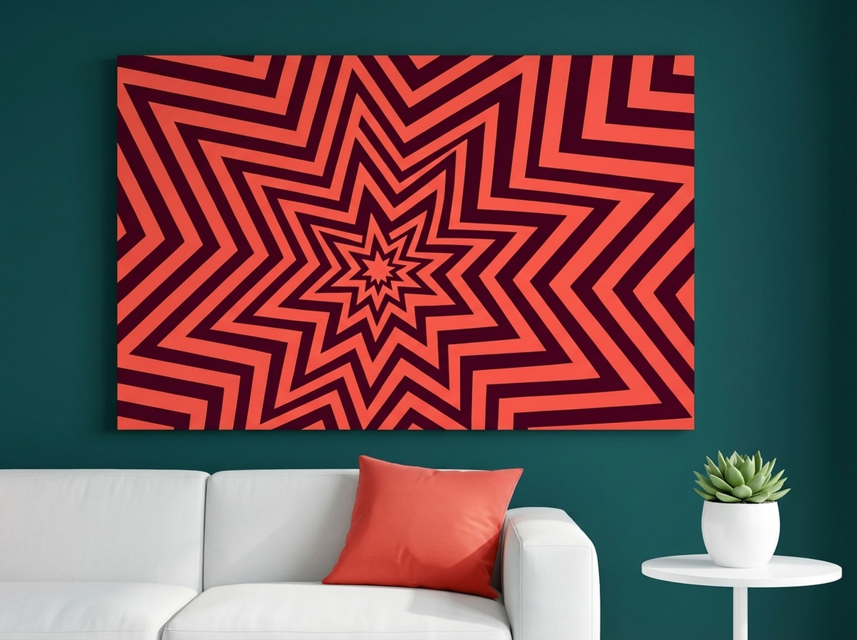
4. Geometric Starburst Canvas Print
Pure 1970s energy. This op-art starburst radiates outward in concentric waves of coral red, orange, and burgundy, creating an optical illusion of depth and movement. Op art (short for optical art) was pioneered by artists like Bridget Riley and Victor Vasarely in the 1960s and became a mainstream design element by the 1970s. This print channels that legacy into a bold accent piece. Hang it on a white or light grey wall to let the warm reds pop. At 60 by 60 cm (24 by 24 inches) square format, it sits perfectly on a staircase landing or as the centrepiece of a small gallery wall. Avoid placing it opposite a window where direct sunlight might compete with the optical effect.
5. Tokyo City Pop Retro Poster Canvas Print
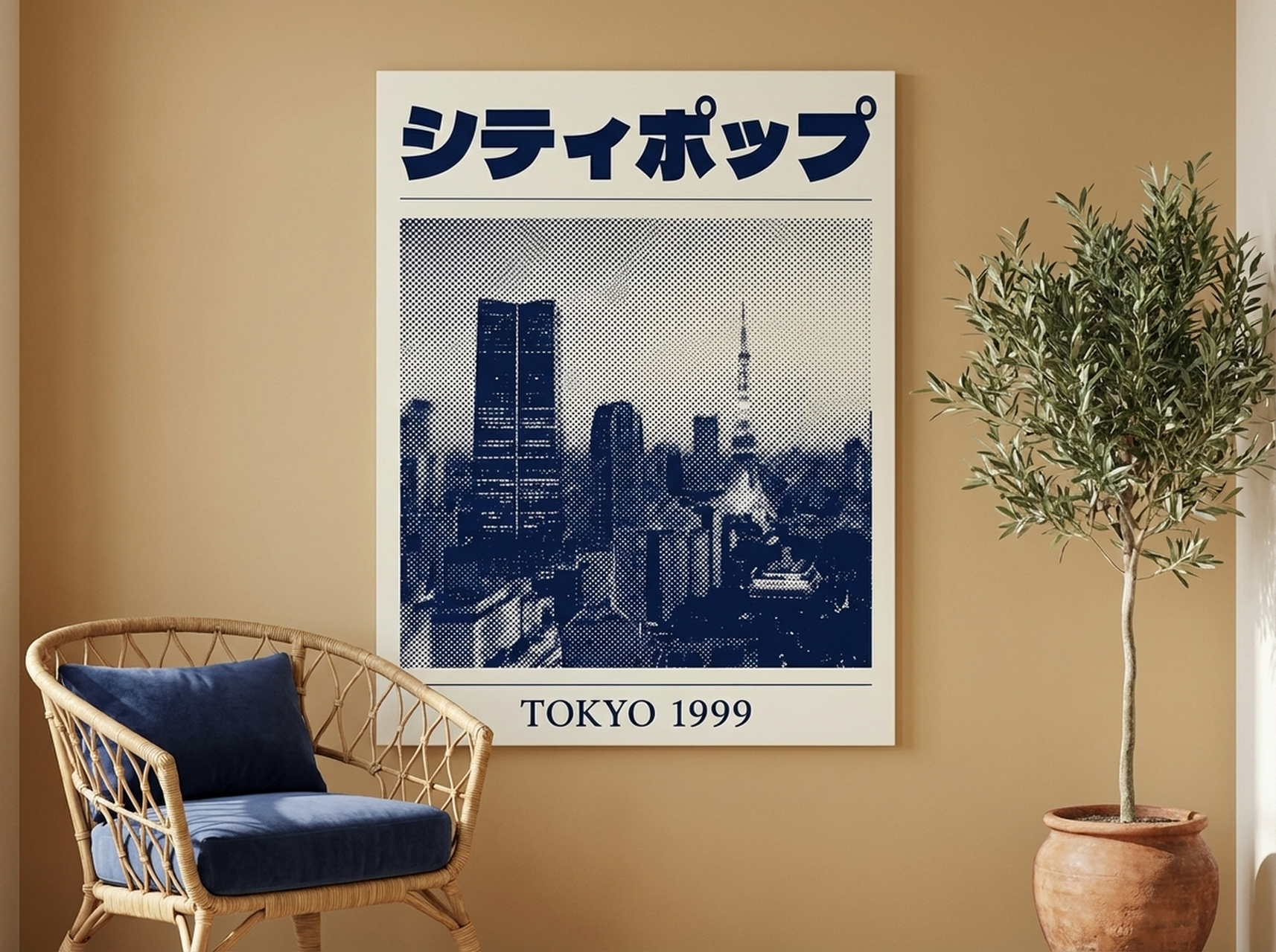
A love letter to Japanese city pop culture of the 1980s, this print layers halftone textures, vintage typography, and a navy-and-cream palette into a travel poster that never actually existed. City pop, a genre of Japanese funk and boogie, has experienced a massive global revival, and its visual aesthetic, neon skylines filtered through a warm analogue glow, translates beautifully to wall art. The restrained palette makes this piece easier to live with than louder retro prints. It suits a home office where you want visual interest without distraction, or a hallway where the narrow format (available in portrait orientation) fills vertical wall space. The cream background picks up natural light, making even a dim corridor feel brighter.
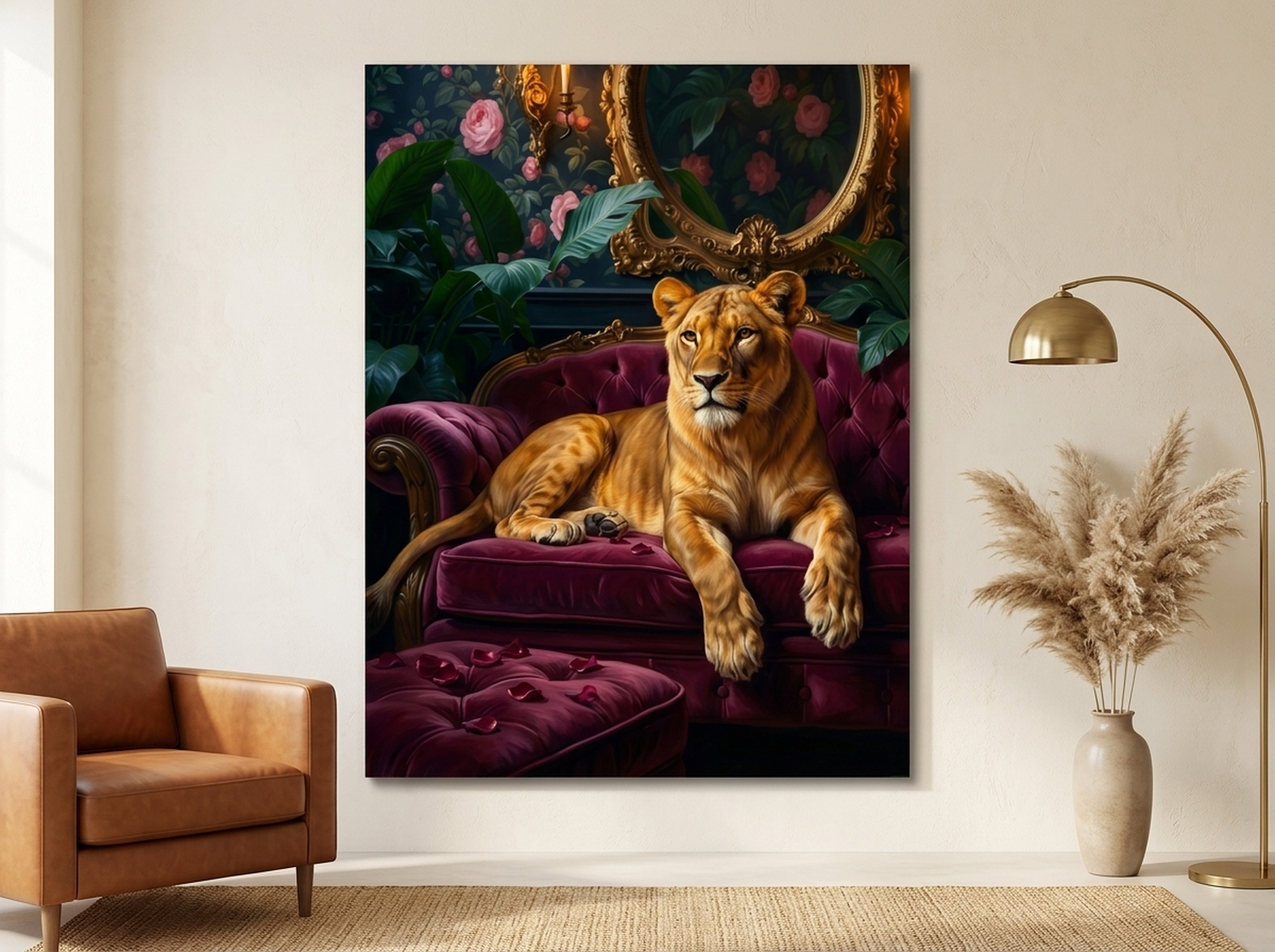
6. Lioness Baroque Canvas Wall Art
Not all retro art comes from the twentieth century. This baroque-inspired lioness painting, rendered in rich burgundy, gold, green, and pink, channels the opulence of seventeenth-century Dutch and Flemish art. The lioness is crowned with flowers, a motif borrowed from classical still-life painting, and the dark background creates dramatic chiaroscuro lighting. This is a maximalist statement piece best suited to formal living rooms, libraries, or any space where you want to project authority and richness. Hang it above a dark leather sofa or a deep-toned credenza. The gold tones in the painting respond beautifully to warm-white lighting, so a picture light or directional spotlight (angled at 30 degrees, placed 60 to 90 cm / 24 to 36 inches from the wall) will bring out every brushstroke detail. For more on lighting your art, see our guide on how to light wall art like a gallery.
Styling Guide: Placement, Sizing, and Framing
Retro wall art has strong visual personality, which means placement and proportion matter more than with a neutral abstract print. Here are the specific measurements and rules to follow.
Height
Hang the centre of the artwork at 145 cm (57 inches) from the floor. This is the standard gallery height used by museums worldwide, and it ensures the art sits at average eye level whether you are standing or seated nearby. If the art hangs above furniture (a sofa, console, or headboard), position the bottom edge 15 to 25 cm (6 to 10 inches) above the top of the furniture piece.
Width Relative to Furniture
The artwork should span 50 to 75 percent of the width of the furniture below it. Above a 180 cm (72 inch) sofa, that means a canvas between 90 and 135 cm (36 and 53 inches) wide. A retro print that is too narrow for the sofa beneath it looks like an afterthought. Too wide, and it overwhelms the furniture.
Grouping Retro Prints
If you are building a gallery wall with multiple retro pieces, keep spacing consistent at 5 to 8 cm (2 to 3 inches) between frames. Mix eras deliberately: an Art Deco geometric beside a 1970s starburst beside a baroque animal portrait creates a collected-over-time look that feels intentional rather than chaotic. For a full walkthrough, our gallery wall layout guide covers templates, spacing tools, and arrangement formulas.
Frame Selection for Retro Art
The frame bridges the art and the room. For mid-century pieces, a natural or espresso wood frame echoes the warm timber tones of the era. For Art Deco or disco-era prints, matte black creates a sophisticated boundary. White frames work best with 1970s pop-art colours because the white border cools down the warm palette and prevents visual overload. Our canvas prints ship with a 1.25-inch (3.2 cm) pinewood stretcher bar and your choice of frame finish.
5 Common Mistakes With Retro Wall Art
1. Going Full Theme Room
A single retro canvas print adds character. Retro furniture plus retro lighting plus retro art plus retro tableware equals a costume party, not a home. Limit retro elements to one or two per room and let the rest of the space stay contemporary. The contrast is what makes the vintage piece pop.
2. Ignoring Scale
Retro prints with bold patterns (op-art, starbursts, large typography) need breathing room. Hanging a 30 by 40 cm (12 by 16 inch) op-art print on a large wall makes it look like a postage stamp. Scale up to at least 60 by 90 cm (24 by 36 inches) for pattern-heavy pieces. The pattern needs physical space to create its visual effect.
3. Matching the Frame to the Era Instead of the Room
A chunky gold frame on a 1970s print might feel "authentic," but it fights a modern room. Choose frames that suit your furniture and wall colour, not the decade of the artwork. Matte black and natural wood are the two safest choices for bridging past and present.
4. Hanging Too High
This is the single most common wall art mistake across all styles, but it is especially noticeable with retro prints because their graphic detail rewards close viewing. If your art is more than 160 cm (63 inches) from the floor at centre, it is too high. Drop it to 145 cm (57 inches) and the room will instantly feel more grounded and intentional.
5. Forgetting Lighting
Retro art often uses rich, saturated colours that look flat under cool-white overhead lighting. A warm-white (2700K to 3000K) picture light or adjustable spotlight transforms the piece. Aim the light at a 30-degree angle from above, positioned 60 to 90 cm (24 to 36 inches) from the wall surface, to eliminate glare and bring out colour depth.
Frequently Asked Questions
What is the difference between retro and vintage wall art?
Vintage wall art is a piece genuinely produced in an earlier era, typically 20 or more years ago. Retro wall art is newly made but designed to evoke the style, colours, and motifs of a past decade. Retro prints offer modern print quality, archival inks, and standardised sizing, making them easier to frame, hang, and maintain than true vintage finds.
Which rooms suit retro wall art best?
Living rooms, dens, home offices, and bedrooms are the most popular placements. Retro art also works exceptionally well in dining rooms (a disco-era or Art Deco piece creates a conversation starter) and hallways (narrow retro travel posters fill vertical space beautifully). Bathrooms with dark walls can carry a moody retro print if the piece is framed behind glass to protect against humidity.
How do I mix retro art from different decades without it looking messy?
Unify with frame colour. If every piece in a gallery wall shares the same frame finish (for example, all matte black), the visual consistency overrides the stylistic differences between decades. Keep spacing uniform at 5 to 8 cm (2 to 3 inches) and choose a common colour thread, perhaps every piece includes at least one warm tone like gold, terracotta, or cream.
Will retro wall art go out of style?
Retro and vintage aesthetics are cyclical rather than trend-dependent. Mid-century modern has been popular in interiors for over two decades with no sign of slowing. Art Deco has enjoyed sustained appeal since the 1960s revival. As long as your retro piece is high quality and well-placed, it will outlast most passing trends. According to current design forecasts, vintage-inspired decor is among the strongest movements heading into 2026 and beyond.
What size retro canvas print should I start with?
For your first retro piece, go with 60 by 90 cm (24 by 36 inches). This size works above a sofa, beside a bookcase, or as the anchor of a small gallery wall. It is large enough to make the retro pattern legible and impactful without dominating a standard-sized room. If you have a large blank wall (over 3 metres / 10 feet wide), consider stepping up to 90 by 120 cm (36 by 48 inches).
Can I pair retro wall art with minimalist furniture?
Yes, and this is one of the strongest combinations in interior design right now. A clean-lined sofa in grey or white provides a neutral stage that lets a single retro print command all the visual attention. The key is restraint: one bold retro piece per room, minimal accessories, and a frame colour that matches the minimalist furniture rather than the vintage artwork.
Quick Reference Table
| Product | Best For | Dominant Colours | Link |
|---|---|---|---|
| Paris Retro Ticket | Bedroom, reading nook, travel gallery wall | Lavender, Pink, Cream, Black | View |
| Giant Cassette Tape | Music room, den, teen bedroom | Charcoal, Teal, Cream, Terracotta | View |
| Disco Ball | Bar area, dining room, entertainment space | Forest Green, Silver, Black, Charcoal | View |
| Geometric Starburst | Living room accent wall, staircase landing | Coral Red, Orange, Burgundy | View |
| Tokyo City Pop | Home office, hallway, guest bedroom | Navy, Cream, White, Black | View |
| Lioness Baroque | Formal living room, library, statement wall | Burgundy, Gold, Green, Pink, Black | View |
Retro wall art is one of the most reliable ways to inject warmth, personality, and visual history into a modern home. Whether you gravitate toward the geometric precision of Art Deco, the organic warmth of mid-century design, or the bold saturation of the 1970s, there is a canvas print in this collection that fits your space and your era of choice. Start with one piece, hang it at 145 cm (57 inches), and let it do the talking. Your walls have been waiting for something with a story to tell.
Browse the full retro and vintage collection: Shop Retro Wall Art