Abstract Wall Art: The Ultimate Guide to Choosing Abstracts
The Heva Team
Art Curators & Interior Design Enthusiasts · January 16, 2026 · 17 min read
Abstract art intimidates some buyers. This guide makes choosing the right abstract canvas print simple and confident.
You have found a piece of wall art you love, but something about it feels uncertain. Is it too bold for your bedroom? Too subtle for your living room? Does it even "match" your space? Choosing abstract wall art can feel overwhelming because there are no definitive rules about what it should look like. That freedom is exactly what makes abstract art powerful, and this guide will help you channel it. We will walk through every major abstract style, explain the colour psychology behind each palette, and give you concrete sizing and placement rules so you can make a confident purchase the first time.
Ready to browse? Explore our Abstract Art collection, or keep reading for our top picks and expert tips.
The Five Core Abstract Art Styles (and How to Tell Them Apart)
Understanding the language of abstract art helps you narrow your search from "I want something abstract" to "I want a fluid abstract in warm earth tones." That specificity saves time and leads to purchases you love for years. Here is a breakdown of the five styles you will encounter most often, including the historical movements that shaped them.
1. Geometric Abstraction
Geometric abstract art uses clean lines, defined shapes, and structured compositions. Circles, triangles, rectangles, and grids create visual order and mathematical precision. This style traces back to the early twentieth century with artists like Piet Mondrian and Kazimir Malevich, who stripped art down to pure form and colour. Today, geometric abstracts translate beautifully into home decor because their structured compositions create visual stability. They suit modern, contemporary, Scandinavian, and mid-century interiors where clean lines already dominate. If your furniture has sharp angles and your space leans minimal, geometric abstract art will feel like a natural extension of your design language.
2. Fluid Abstraction
Fluid abstract art features flowing forms, soft edges, and organic movement. Think poured paint effects, watercolour washes, and marbled textures. This style is rooted in the pour techniques pioneered by Helen Frankenthaler in the 1950s, who let thinned paint soak directly into raw canvas to create luminous, soft-edged fields of colour. Fluid abstracts bring softness and natural energy to bedrooms, bathrooms, and relaxation spaces. The organic, unpredictable forms mimic patterns found in nature, like water flowing over stones or clouds drifting across a sunset sky, which is why these pieces feel inherently calming. According to PIPA Fine Art's 2025 wall art trend report, oversized abstract pieces with organic textures are among the top trends in home decor.
3. Colour Field Painting
Colour field abstracts use large areas of flat or subtly varied colour to create immersive, meditative compositions. Mark Rothko and Barnett Newman are the towering figures here, producing canvases that envelope the viewer in pure chromatic experience. These pieces work as powerful statement art in living rooms and dining rooms because they set the emotional tone for an entire space without competing with furnishings. A large colour field canvas in deep navy and burgundy above a dining table creates an atmosphere of intimate sophistication, while one in soft sage and cream can make a living room feel like a serene retreat.
4. Abstract Expressionism
Bold brushstrokes, dynamic energy, and visible texture define this style. Abstract expressionism emerged in the 1940s with artists like Willem de Kooning and Franz Kline, who used gesture and mark-making to convey raw emotion on canvas. The visible impasto and energetic compositions feel passionate and alive. Expressionist abstracts work best as focal points in rooms where you want to create drama and spark conversation. They pair well with spaces that already have some visual weight, like rooms with dark wood furniture, rich textiles, or deep wall colours. A single expressionist piece above a fireplace or at the end of a long hallway commands attention and rewards extended viewing.
5. Minimalist Abstraction
Simple compositions with restrained colour palettes define minimalist abstract art. A single brushstroke, a subtle gradient, a few geometric shapes on a neutral background. This style emerged from the Minimalism movement of the 1960s championed by artists like Agnes Martin and Donald Judd. Minimalist abstracts are perfect for spaces where you want art that adds visual interest without noise. They work wonderfully in bedrooms, home offices, and entryways where the goal is understated elegance rather than dramatic impact. The restraint of minimalist art allows surrounding decor elements, like a beautiful piece of furniture or an architectural detail, to share the spotlight.
Colour Psychology: How Abstract Art Affects Mood
Colour is arguably the most important element in abstract art because, without recognisable subjects, colour does most of the emotional heavy lifting. Researchers at the University of British Columbia found that blue environments enhance creative performance, while red environments improve attention to detail. Understanding these principles helps you choose abstract art that actively supports how you want a room to feel. For a deeper exploration of how specific hues impact your space, see our complete guide to the psychology of colours in wall art.
Blues and greens feel calming, expansive, and restorative. Abstract art in these tones is ideal for bedrooms, bathrooms, and meditation spaces. A teal and emerald abstract in the bedroom promotes deeper relaxation, while seafoam and sage tones in a bathroom create a spa-like atmosphere.
Reds and oranges feel warm, energising, and stimulating. Use these tones in dining rooms and social spaces where lively conversation is the goal. A burnt orange and terracotta abstract above the dining table makes the space feel inviting and convivial.
Yellows and golds feel cheerful, uplifting, and luxurious. Gold-toned abstracts add warmth without heaviness, making them versatile across living rooms, hallways, and entryways. They pair especially well with dark wood furniture and cream-coloured walls.
Black and white feel dramatic, sophisticated, and gallery-like. Monochrome abstracts anchor a room with graphic impact and work in virtually every colour scheme because they serve as neutrals. They are particularly effective in modern and contemporary spaces.
Earth tones (terracotta, sage, cream, warm brown) feel grounded, organic, and universally harmonious. When you are uncertain about committing to bold colour, earth-toned abstracts are the safest investment. They work in nearly every room and with nearly every design style, from farmhouse to Japandi.
The 60-30-10 Colour Rule Applied to Abstract Art
In interior design, 60 percent of a room's colour comes from walls and large furniture, 30 percent from secondary elements like curtains and rugs, and 10 percent from accent pieces. Your abstract art can play in either the 30 or the 10 category. If your room is mostly neutral (cream walls, grey sofa), let a bold abstract be your vibrant 10 percent accent. If your room already has strong colour in the textiles, choose a tonal abstract that bridges between existing hues rather than introducing entirely new ones.
Choosing Abstract Art by Room
Living room. This is where you can be boldest. A large abstract canvas, 61 x 91 cm (24 x 36 in) or bigger, above the sofa creates a commanding focal point. If your room is mostly neutral, a vibrant abstract in blues, reds, or golds adds life. If your space is already colourful, a tonal abstract in neutrals provides balance. For detailed living room picks, see our best abstract wall art for living rooms guide.
Bedroom. Calming abstracts work best here. Look for pieces with soft, flowing forms and muted colours. Pale blues, soft greens, warm greys, and gentle blush tones promote relaxation. Avoid high-contrast or intensely saturated pieces that might feel too energising for a sleep space. Hang the art 15 to 20 cm (6 to 8 in) above the headboard for a cohesive, grounded look.
Dining room. Abstract art in warm tones, think amber, burgundy, deep teal, or gold, creates an inviting atmosphere. A single statement piece on the main wall, approximately 76 x 102 cm (30 x 40 in), adds sophistication without formality.
Home office. Choose abstracts that inspire focus and creativity. Cool blues and greens promote concentration, while warm tones with dynamic compositions can spark creative thinking. Keep the piece moderate in size, around 51 x 61 cm (20 x 24 in), so it inspires without distracting.
Entryway. A vertical abstract in your entryway sets the artistic tone for your entire home. Choose something eye-catching but not overwhelming. Medium saturation colours in a confident composition make a memorable first impression.
Bathroom. Small abstracts in cool or aquatic tones, blues, teals, soft greens, feel natural in bathrooms. A single canvas print, around 41 x 51 cm (16 x 20 in), can transform a utilitarian space into something spa-like and intentional. Our matte canvas with archival inks resists humidity-related damage far better than paper prints.
Our 6 Expert Picks Across Every Abstract Style
We have selected six pieces from our collection that represent different abstract styles. Each one demonstrates a different approach to abstraction, so you can see which visual language resonates with your taste and your space.
1. Geometric Texture Panels (Geometric)
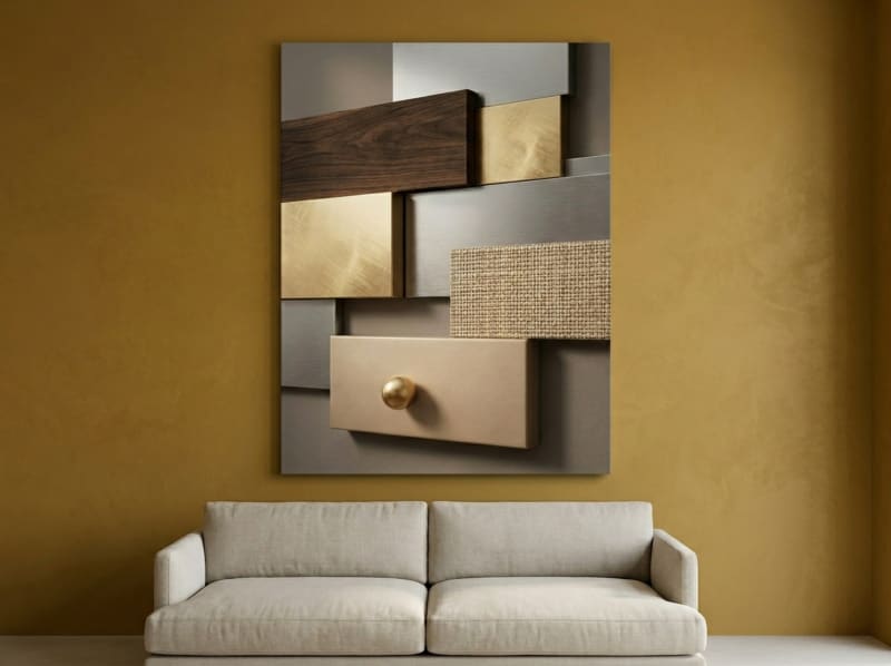
This piece is a masterclass in geometric abstraction. Structured panels of walnut, gold, and silver create a composition that feels architecturally precise yet warmly inviting. The textural variation across each block catches light differently throughout the day, adding subtle dynamism to what initially reads as a calm, ordered piece. At 61 x 91 cm (24 x 36 in), it anchors a hallway or living room wall with quiet authority. The neutral metallic palette works with virtually any colour scheme, from warm creams to cool greys.
View the Geometric Texture Panels
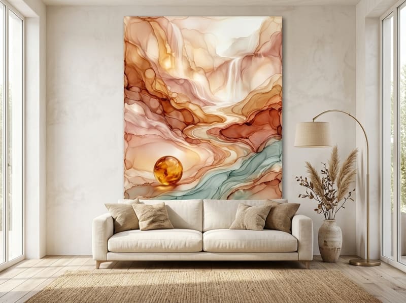
2. Fluid Abstract Landscape (Fluid)
Flowing rivers of gold, amber, and teal move across this canvas like a sunset reflected in still water. This is fluid abstraction at its most lyrical: the organic forms feel entirely natural, as if the paint found its own path across the surface. The warm gold tones create an inviting glow that makes any room feel like golden hour. This piece is ideal for bedrooms and reading nooks where you want art that encourages slow, contemplative viewing. The combination of warm and cool tones means it bridges different colour palettes effortlessly.
View the Fluid Abstract Landscape
3. Geometric Starburst (Op Art)
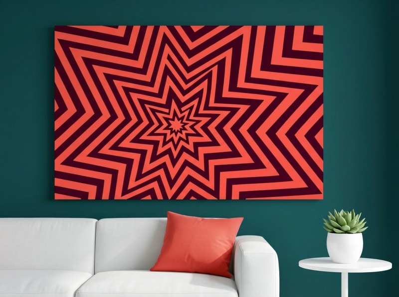
Bold concentric circles in coral red and warm orange pulse with kinetic energy on this canvas. Rooted in the Op Art movement of the 1960s, this piece plays with your perception: the concentric rings seem to vibrate and expand the longer you look. It is a conversation starter in the truest sense. This starburst works brilliantly as a statement piece in a bedroom, lounge, or creative studio where you want the art to energise the room. The warm red and orange palette adds heat and vibrancy, making it an ideal focal point against white, grey, or deep navy walls.
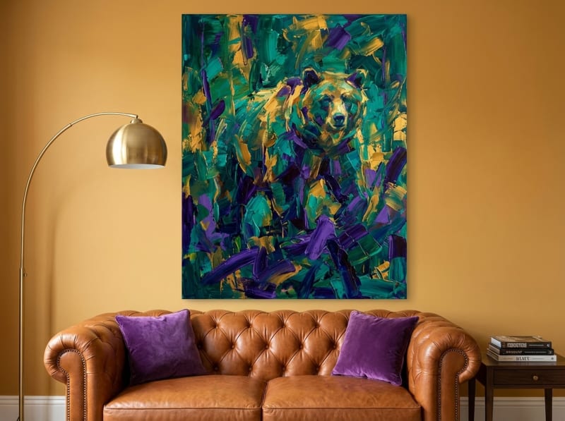
4. Abstract Grizzly Bear (Expressionist)
This abstract grizzly bear emerges from a storm of emerald, gold, and purple brushstrokes, embodying the raw emotional power of abstract expressionism. The visible texture and dynamic mark-making give the piece a sense of movement and life that flat, digital prints simply cannot achieve. The subject is secondary to the feeling: strength, wildness, and untamed beauty expressed through colour and gesture. Hang this in a living room or den where it can serve as a dramatic focal point. The jewel-tone palette adds richness to both neutral and colourful spaces.
View the Abstract Grizzly Bear
5. Canyon Strata (Earth Abstract)
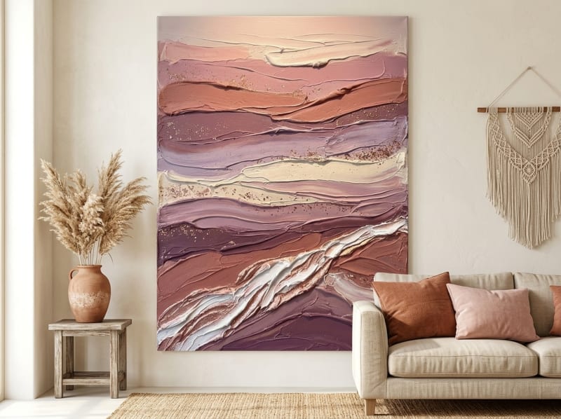
Layers of rose, terracotta, burgundy, and cream stack like geological strata in a canyon wall. This piece captures the beauty of natural formations through an abstract lens, using thick impasto-style texture to create depth you can almost feel. Earth-toned abstracts like this one are the Swiss Army knife of wall art: they work in virtually any space and with virtually any design style. The warm palette adds cosiness to dining rooms and living areas, while the layered composition rewards close viewing with details that reveal themselves over time.
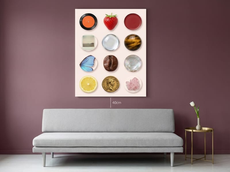
6. Curated Objects Collage (Maximalist)
This piece takes the "more is more" approach of maximalist abstraction and makes it sing. Collected objects, botanical fragments, and geometric shapes layer together in soft blush pink and cream tones to create a composition that feels like a visual diary. Unlike the restraint of minimalist art, this collage-style abstract rewards extended viewing: every time you look, you discover something new. It pairs beautifully with eclectic, boho, and creative spaces where the goal is personality over perfection. The soft colour palette keeps the maximalist energy feeling refined rather than chaotic.
View the Curated Objects Collage
Size and Placement: The Numbers That Matter
Getting the size and placement right makes or breaks your abstract art display. Here are the specific measurements interior designers use.
The two-thirds rule. Art above furniture should span approximately two-thirds the width of the piece below it. Above a 183 cm (72 in) sofa, aim for about 122 cm (48 in) of art width. This proportion looks intentional and balanced. Going narrower makes the art look like an afterthought; going wider can make the furniture look small.
Gallery-height hanging. The centre of your artwork should sit approximately 145 cm (57 in) from the floor, which is the standard gallery hanging height used by museums worldwide. Above a sofa, hang the bottom edge of the frame 15 to 30 cm (6 to 12 in) above the sofa back. For a detailed step-by-step guide, read our article on how to choose the perfect wall art size.
Go bigger than you think. The single most common mistake in wall art is choosing pieces that are too small. A small canvas on a large wall looks like an afterthought. A large abstract that confidently fills 60 to 75 percent of the available wall width always looks more intentional than a small piece floating in empty space. When in doubt, size up.
Grouping abstracts. When hanging multiple abstract pieces together, maintain consistent spacing of 5 to 8 cm (2 to 3 in) between canvases. A diptych (two-piece set) or triptych (three-piece set) can fill a wide wall beautifully while creating visual rhythm. Keep the colour palette or style consistent across grouped pieces, even if the individual compositions differ.
Vertical vs horizontal. Landscape-oriented (horizontal) canvases work best above sofas, beds, and dining tables. Portrait-oriented (vertical) canvases work best in entryways, narrow walls, and flanking doorways. Match the orientation to the wall shape for the most natural fit.
Common Mistakes to Avoid
Mistake 1: Choosing art that is too small. We see this constantly. A 30 x 41 cm (12 x 16 in) canvas above a large sofa looks like a postage stamp on a billboard. The minimum size for above a standard sofa is 61 x 91 cm (24 x 36 in), and 76 x 102 cm (30 x 40 in) is even better. Measure your wall first and commit to a piece that actually fills it.
Mistake 2: Ignoring the room's existing colour story. A vibrant red and orange abstract in a room with cool blue and grey tones creates visual tension rather than harmony. Before buying, identify the two or three dominant colours in your room and choose abstract art that includes at least one of those hues. This creates a colour bridge between the art and the space.
Mistake 3: Hanging art too high. Most people hang artwork at their standing eye level, which places it too high when you are seated on a sofa or at a dining table. The centre of the artwork should be at 145 cm (57 in) from the floor, or 15 to 30 cm (6 to 12 in) above the nearest furniture piece.
Mistake 4: Matching art to the sofa instead of the room. Your art should complement the entire room, not just the piece of furniture below it. Step back and look at the walls, curtains, rug, and accents as a whole. The art should feel like it belongs in the space, not like it is an extension of one furniture item.
Mistake 5: Buying based on trend alone. Trends in abstract art come and go, but the pieces you truly connect with emotionally will give you joy for years. If a trending style does not speak to you, skip it. The best abstract art is the piece that makes you stop and feel something every time you walk past it.
Buying Tips for Abstract Canvas Prints
Preview digitally first. Take advantage of room mockups and lifestyle photos on product pages. Better yet, cut a piece of paper or cardboard to the art's dimensions and hold it against your wall. This ten-second exercise prevents most sizing mistakes.
Invest in canvas over paper. Canvas prints have texture, depth, and a gallery-quality appearance that paper prints cannot match. The canvas weave adds subtle dimension that makes abstract art come alive, and canvas holds up far better over time without yellowing. According to Montcarta's guide to contemporary abstract art, textured canvas surfaces enhance the three-dimensional quality that makes abstract art compelling.
Check the stretcher bar quality. Premium canvas prints use kiln-dried wood stretcher bars that resist warping and twisting. Cheap alternatives use green wood that can warp within months, pulling your canvas out of shape. All our canvases at HEVA use solid wood frames with kiln-dried stretcher bars.
Look for archival inks. UV-resistant, archival-quality inks ensure your abstract art looks vibrant for years, even in rooms with natural light. This is especially important for pieces hung near windows or in south-facing rooms. Our prints use archival inks that resist fading for decades.
Choose the right frame colour. We offer four frame colours: black, white, espresso, and natural wood. Black frames add graphic punch and suit modern interiors. White frames feel light and gallery-like. Espresso frames bring warmth. Natural wood frames suit Scandinavian, farmhouse, and boho spaces. As a general rule, match the frame colour to the dominant wood or metal tone in the room.
Ready to Find Your Abstract?
Every piece in our collection is a gallery-quality framed canvas print that arrives ready to hang. Free US shipping on all orders.
Frequently Asked Questions
What is the difference between abstract art and modern art?
Modern art is a historical period (roughly 1860s to 1970s) that includes many styles, from Impressionism to Pop Art. Abstract art is a specific approach within modern art that moves away from representing recognisable objects. All abstract art falls under the modern and contemporary art umbrella, but not all modern art is abstract. When shopping for wall decor, "abstract" tells you about the visual style (non-representational), while "modern" tells you about the design aesthetic (clean, current, uncluttered).
How do I choose abstract art that matches my furniture?
Start by identifying two or three dominant colours in your room, including wall colour, sofa, rug, and curtains. Choose abstract art that shares at least one of those colours and introduces one complementary accent. For example, if your room has grey walls and a cream sofa, an abstract with grey, cream, and a pop of teal creates connection while adding something new. Avoid trying to match exactly; instead, aim for a colour bridge.
What size abstract art should I hang above a sofa?
The art should span approximately two-thirds the width of the sofa. For a standard 183 cm (72 in) sofa, that means canvas art around 122 cm (48 in) wide. If using a single piece, go for at least 61 x 91 cm (24 x 36 in). Hang the bottom edge 15 to 30 cm (6 to 12 in) above the sofa back. A single large piece typically looks more intentional than several small ones scattered above the sofa.
Can abstract art work in a traditional or farmhouse-style home?
Absolutely. The key is choosing abstracts with colours and textures that complement the existing decor. Earth-toned abstracts with visible texture, like our Canyon Strata piece, feel right at home in farmhouse and rustic interiors. Soft, muted colour fields work well in traditional settings. The abstract style adds a layer of contemporary sophistication that keeps traditional rooms from feeling dated.
Do your canvas prints come framed and ready to hang?
Yes. Every canvas print ships in a solid wood frame with pre-installed hanging hardware. Choose from four frame colours: black, white, espresso, or natural wood. The canvas is printed on premium matte material with archival inks and arrives ready to hang straight out of the box.
How do I care for canvas wall art to keep it looking new?
Keep canvas prints out of direct, prolonged sunlight to prevent fading. Dust them gently with a soft, dry microfibre cloth every few weeks. Avoid hanging canvas art directly above a shower or in areas with extreme humidity. Our prints use UV-resistant archival inks that maintain vibrancy for years under normal household conditions.
Quick Reference Table
| Product | Style | Best For | Dominant Colours | Link |
|---|---|---|---|---|
| Geometric Texture Panels | Geometric Abstract | Modern living rooms, hallways, executive offices | Walnut, Gold, Silver, Cream | View |
| Fluid Abstract Landscape | Fluid Abstract | Bedrooms, spa-inspired bathrooms, reading nooks | Gold, Cream, Terracotta, Teal | View |
| Geometric Starburst | Op Art / Kinetic | Bold bedrooms, retro lounges, statement walls | Coral, Red, Orange, Burgundy | View |
| Abstract Grizzly Bear | Expressionist Abstract | Living rooms, dens, nature-inspired spaces | Emerald, Gold, Purple, Teal | View |
| Canyon Strata | Geological / Earth Abstract | Dining rooms, earthy living rooms, rustic-modern spaces | Rose, Terracotta, Burgundy, Cream | View |
| Curated Objects Collage | Maximalist / Collage Abstract | Eclectic living rooms, creative studios, boho bedrooms | Blush Pink, Cream, Gold, Sage | View |
Start Your Abstract Art Journey Today
Abstract wall art is an investment in how your home looks and how it feels. The right piece sparks joy every time you walk into the room, creates conversation when guests visit, and evolves in meaning as your life changes. That is the beauty of abstract art: it grows with you because there is always something new to see.
At HEVA Unique Art, we design original abstract canvas prints that bring gallery-quality sophistication to everyday spaces. Every piece is printed on premium matte canvas with archival inks and framed in solid wood, ready to hang the moment it arrives. Whether you want a bold expressionist statement or a serene minimalist accent, our abstract collection has something for every wall and every style.
Browse the Abstract Art Collection
Continue exploring wall art with our guides on abstract art for living rooms, the psychology of colours in wall art, and choosing the right wall art size.